Inviting walls to glow rather than glare, off-white paint bridges the gap between crisp gallery white and creamy neutrals, letting light, furnishings, and mood shift gracefully throughout the day. Design editors and color pros routinely single out warm classics like Benjamin Moore’s Swiss Coffee and Sherwin-Williams’ Alabaster for their timeless flexibility, while Farrow & Ball’s artisanal tints prove that even subtle shades offer personality. Below, you’ll find 25 carefully chosen off-white hues — each with undertone notes, lighting tips, and style pointers — to help you sample with confidence and land on the perfect whisper-soft backdrop.
1. White Dove Off-White Paint: Understated Elegance
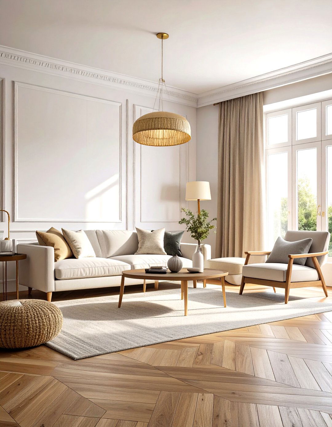
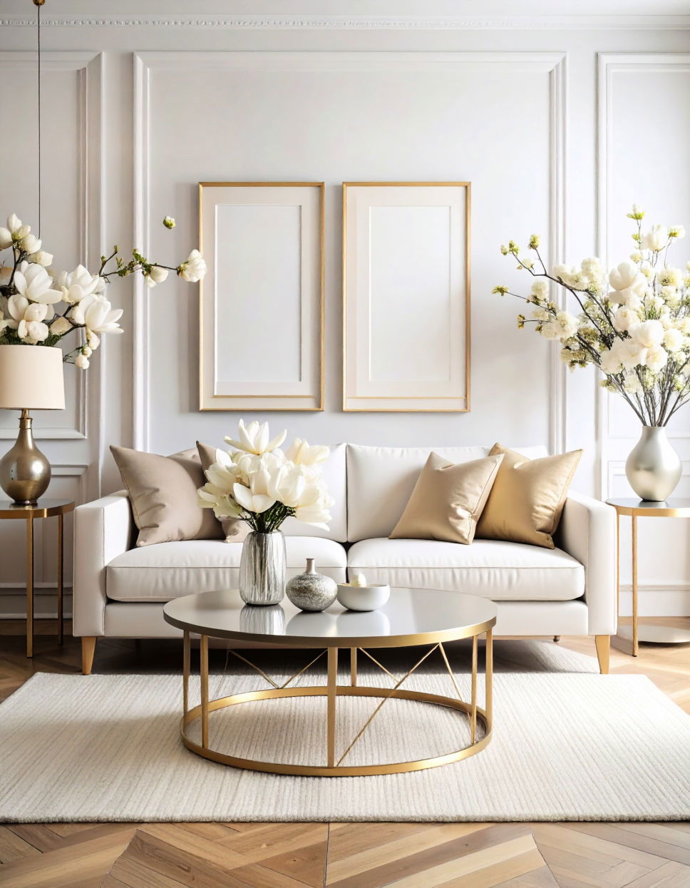
A sun-washed hush settles over a room when Benjamin Moore’s White Dove off-white paint (OC-17) meets morning light. Warm gray and faint beige pigments soften its high 83 LRV, so trim and ceilings read cohesive instead of stark. Because the shade leans neither blue nor yellow, it flatters wood floors, brass fixtures, and even bold art, making it a go-to for open-plan living areas where you want one envelope color. Roll it in an eggshell finish for gentle reflectance, then anchor the scheme with oatmeal textiles or black metal accents to keep the palette grounded and current.
2. Alabaster Off-White Paint: Spa-Calm Warmth
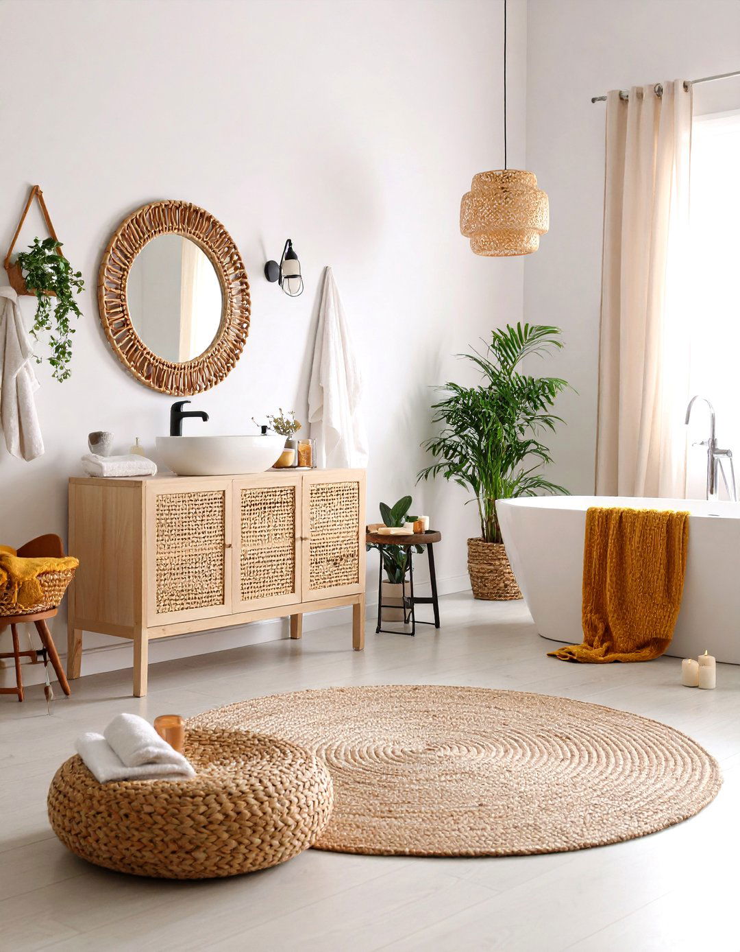
The instant a wall takes on Sherwin-Williams’ Alabaster off-white paint (SW 7008) , the space feels wrapped in candlelight. Yellow-beige undertones lend a creamy cast that stops short of true cream, keeping windowless bathrooms or north-facing bedrooms from looking chilly. Designers often pair Alabaster with rattan furniture or sandy linens to echo its mellow vibe, but you can sharpen it with matte black hardware for a modern farmhouse twist. Use a satin sheen on trim to subtly differentiate planes without switching colors, simplifying touch-ups down the road.
3. Cloud White Off-White Paint: Soft Daylight Boost
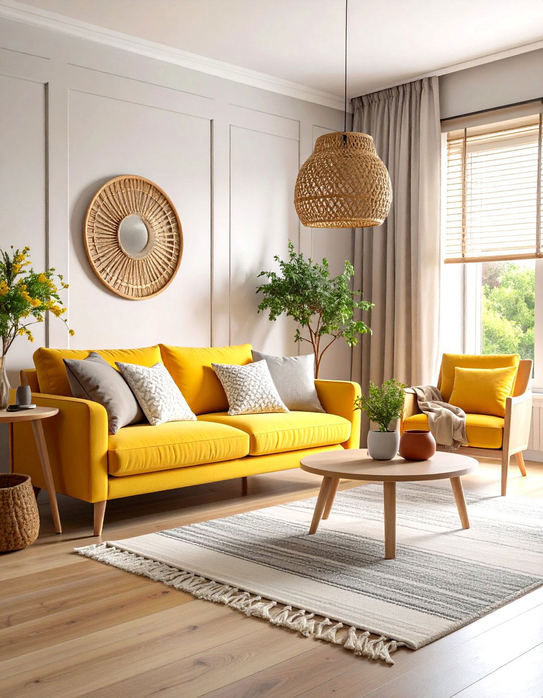
Looking for a bright yet padded backdrop? Benjamin Moore’s Cloud White off-white paint (OC-130) lifts shadows with its gentle yellow base while a neutral core keeps glare in check. At roughly 85 LRV, it’s ideal for low-ceiling rooms that need visual height. Layer it with woven blinds and terracotta pots to highlight the shade’s cozy leanings, or team it with polished nickel if you crave crispness. Always sample on at least two walls; western light can exaggerate its warmth after 4 p. m. , nudging you toward cooler accessories for balance.
4. Pointing Off-White Paint: Cottage Freshness
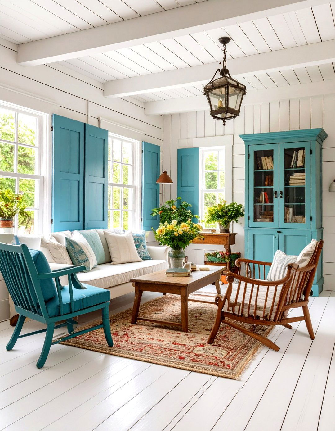
A, Farrow & Ball’s Pointing off-white paint (No. 2003) borrows its name from lime mortar, and that heritage shows in its delicate, handcrafted warmth. Subtle red-yellow undertones give bead-board ceilings or shiplap walls an inviting glow that pairs beautifully with sage cabinetry or antique pine. Because the artisanal pigments shift with daylight, use it in rooms where softness, not starkness, is the goal — think reading nooks or guest bedrooms. Finish with the brand’s Estate Eggshell for a velvety, low-sheen surface that hides minor wall dings while still bouncing light.
5. Simply White Off-White Paint: Clean Yet Cozy
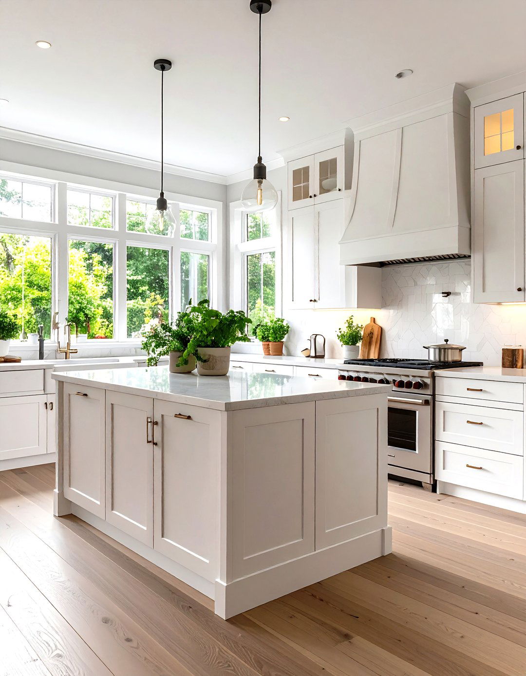
To banish dingy shadows without veering institutional, reach for Benjamin Moore’s Simply White off-white paint (OC-117). The color marketing team calls it “clean and crisp, ” but a breath of yellow keeps it from looking blue under LED bulbs. It was even crowned Color of the Year for its crowd-pleasing adaptability. Use semi-gloss on trim for a classic contrast, or flood cabinets and walls in the same finish for Scandinavian minimalism. One caveat: test near bright-green landscaping; reflected foliage can tip Simply White a hint lime at noon.
6. Snowbound Off-White Paint: Cool Contemporary Edge
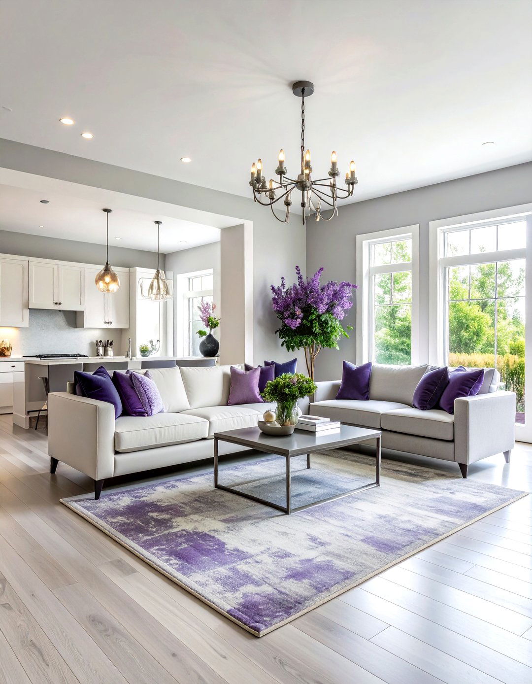
Unlike creamier picks, Sherwin-Williams Snowbound off-white paint (SW 7004) carries a gray-violet vein that neutralizes pink-beige carpets or trending taupe tiles. Its 83 LRV delivers brightness without the iciness of a blue-based white, so it’s superb for modern condos filled with stainless steel. Try brushing it on built-ins, then coat the ceiling in the same tint 50 percent lightened to elongate walls visually. If you’re installing LED strips, aim for a 3000 K bulb to keep Snowbound’s subtle warmth intact at night.
7. Swiss Coffee Off-White Paint: Gentleman’s Cream
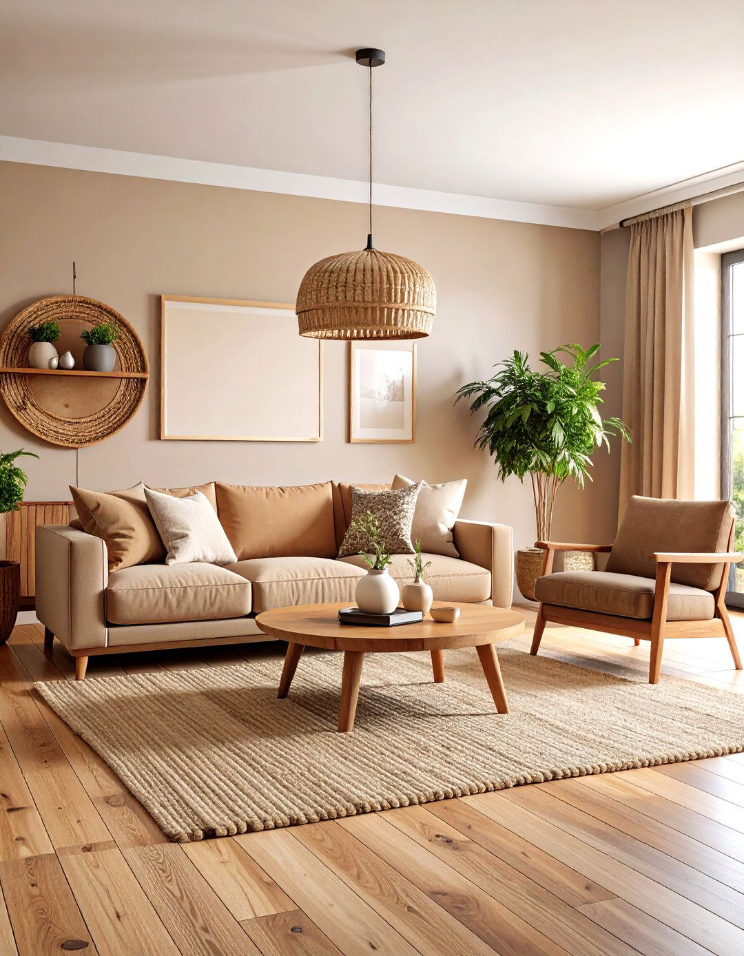
Certainly, few hues rival Benjamin Moore’s Swiss Coffee off-white paint (OC-45) for cozy sophistication. Cream-almond undertones read like steamed milk in morning light, flattering rich leathers and reclaimed oak. With an LRV just under 82, it’s bright but not blinding — perfect for whole-house cohesion. Elevate character by spraying doors and baseboards in a satin Swiss Coffee while walls stay eggshell. For extra depth, layer jute rugs and black-framed art; the muted backdrop makes dark accents pop without harsh contrast.
8. Cameo White Off-White Paint: Subtle Blush Lift
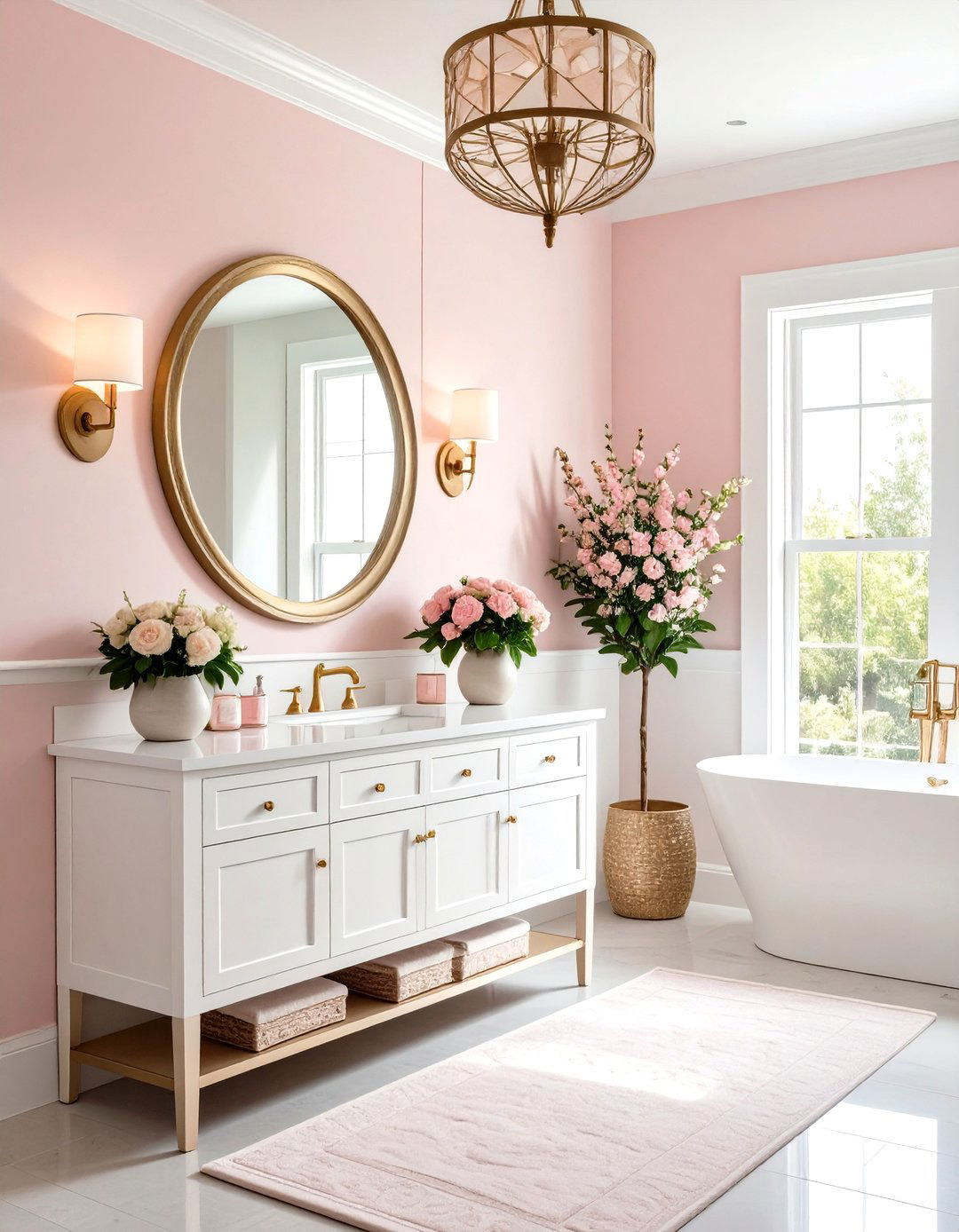
Surprisingly, Behr’s Cameo White off-white paint (MQ3-32) sneaks in a pearly pink whisper that flatters complexions — handy for powder rooms or vanity corners. Its one-coat-hide formula speeds weekend projects, but always roll a sample swath first; warm LEDs can amplify the rouge note. Pair with unlacquered brass mirrors to enhance the feminine glow, or temper sweetness using matte charcoal sconces. Because this blush-tinged neutral straddles white and pastels, it harmonizes with floral wallpapers when you crave pattern without overwhelming brightness.
9. School House White Off-White Paint: Heritage Calm
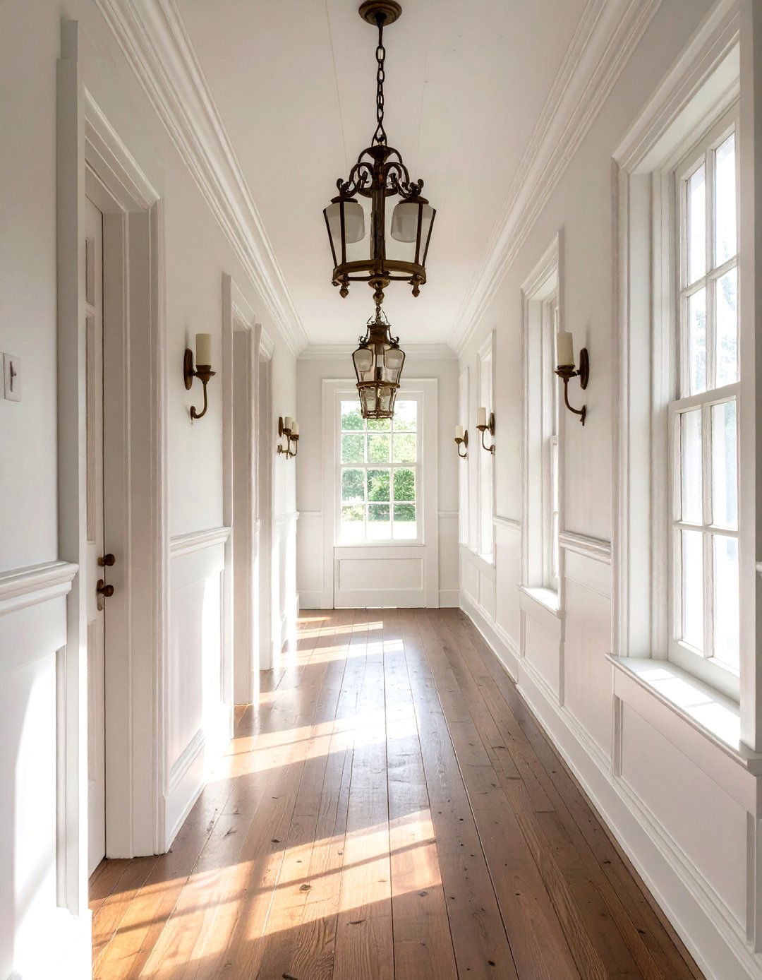
With a nod to vintage classrooms, Farrow & Ball’s School House White off-white paint (No. 291) offers muted warmth minus yellow glare. Designers praise its ability to look “white” in shadow yet reveal depth beside brighter trim, making it stellar for hallways or mudrooms that flow into lighter spaces. Combine it with aged brass hooks and milk-glass pendants for instant nostalgia, or push modern by surrounding it with matte-black frames. Because pigments are richer than mass-market paints, order a sample pot to verify undertone shifts across morning and evening light.
10. Delicate White Off-White Paint: True Neutral Clarity
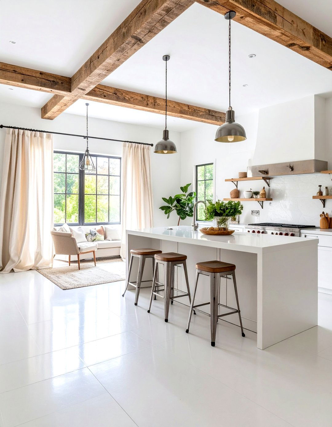
For those who fear yellow cast, PPG’s Delicate White off-white paint (PPG 1001-1) provides a practically undertone-free canvas. Its lofty 88 LRV maximizes bounce, brightening basement studios or dim corridors. Since it reads pure, layer texture — bouclé throws, raw linen drapes — to prevent sterility. The color tolerates cool metals well, so nickel faucets or chrome barstools remain crisp. Seal high-traffic walls with a scrubbable eggshell; a magic-eraser removes scuffs without burnishing the finish, keeping that airy freshness intact year after year.
11. Whisper Off-White Paint: West-Coast Bright
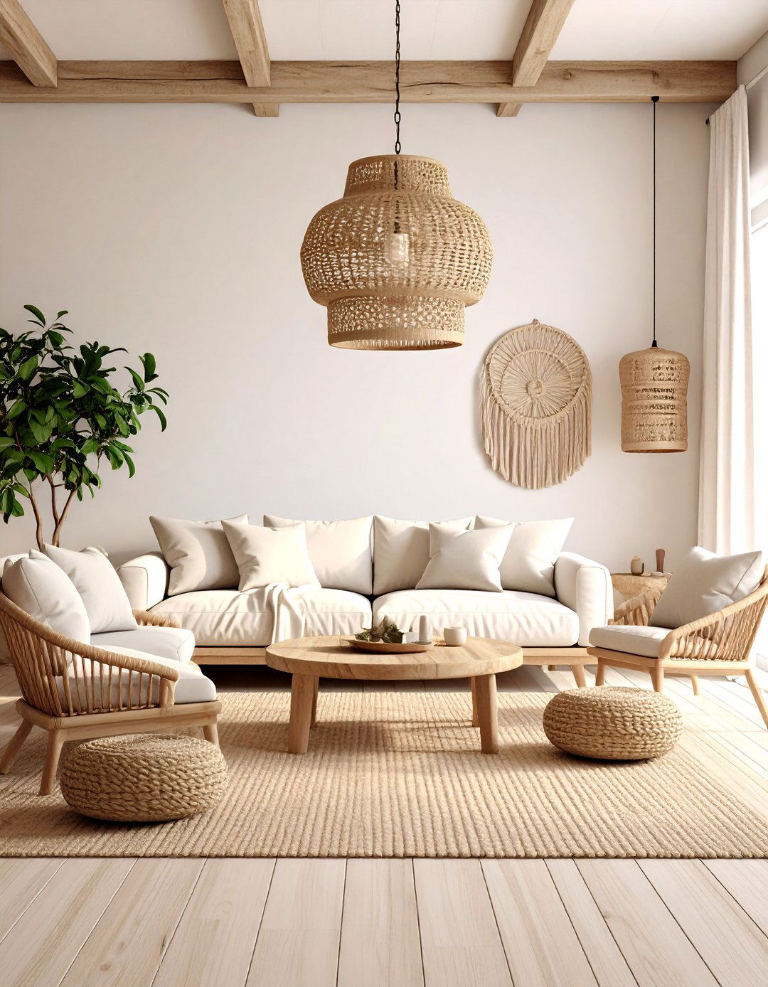
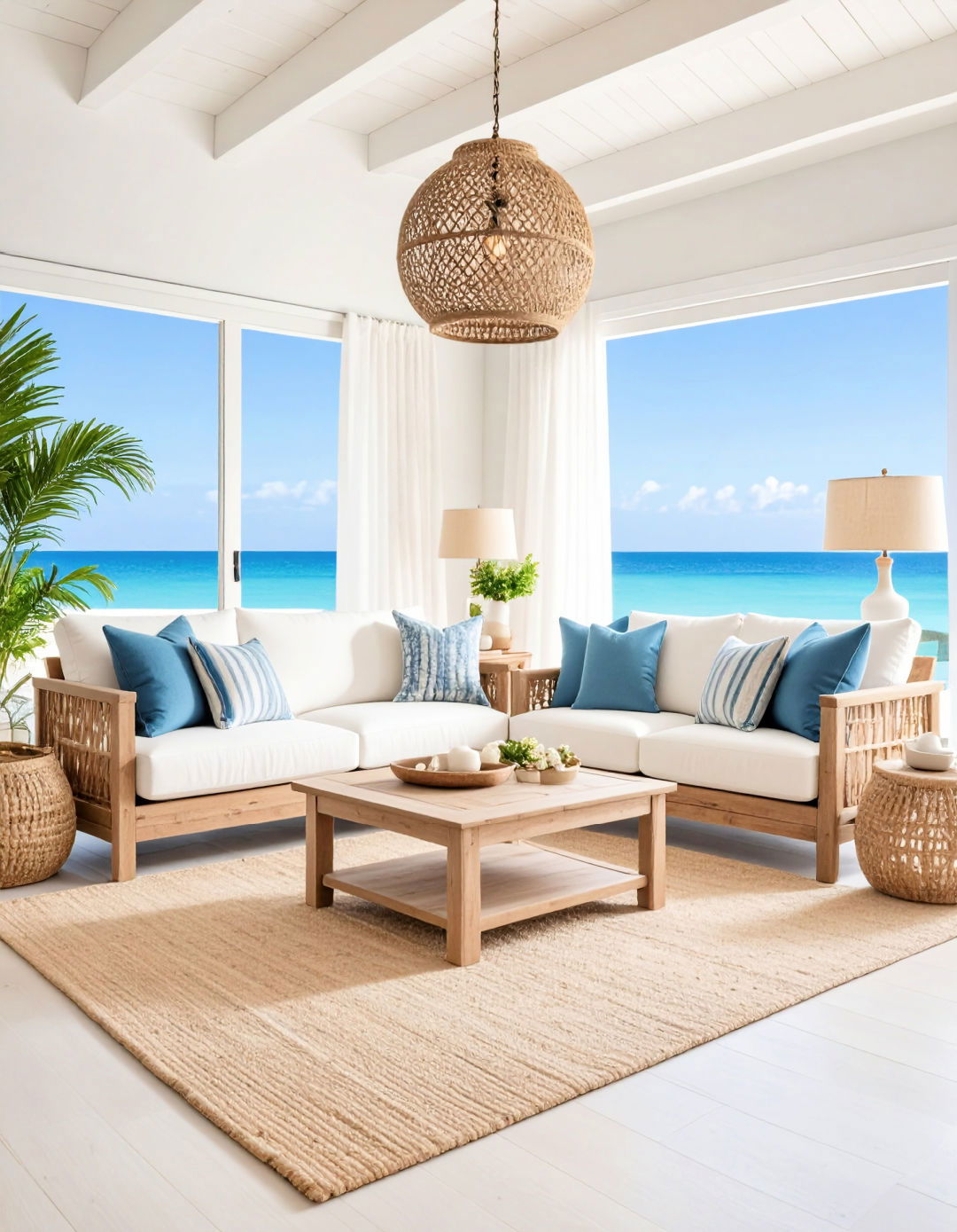
Owing to its popularity among California builders, Dunn-Edwards Whisper off-white paint (DEW 340) delivers sun-splashed warmth ideal for coastal décor. Subtle cream undertones soften the glare of vast windows, while still feeling bright enough for shaded porches. Use it as both wall and trim color in matte to hide texture on older plaster; break monotony by adding rope-weave light fixtures or driftwood accents. If you crave contrast, specify doors in a half-strength Whisper satin — the monochrome palette feels tailored, not flat.
12. Cream in My Coffee Off-White Paint: Cozy Café Vibe
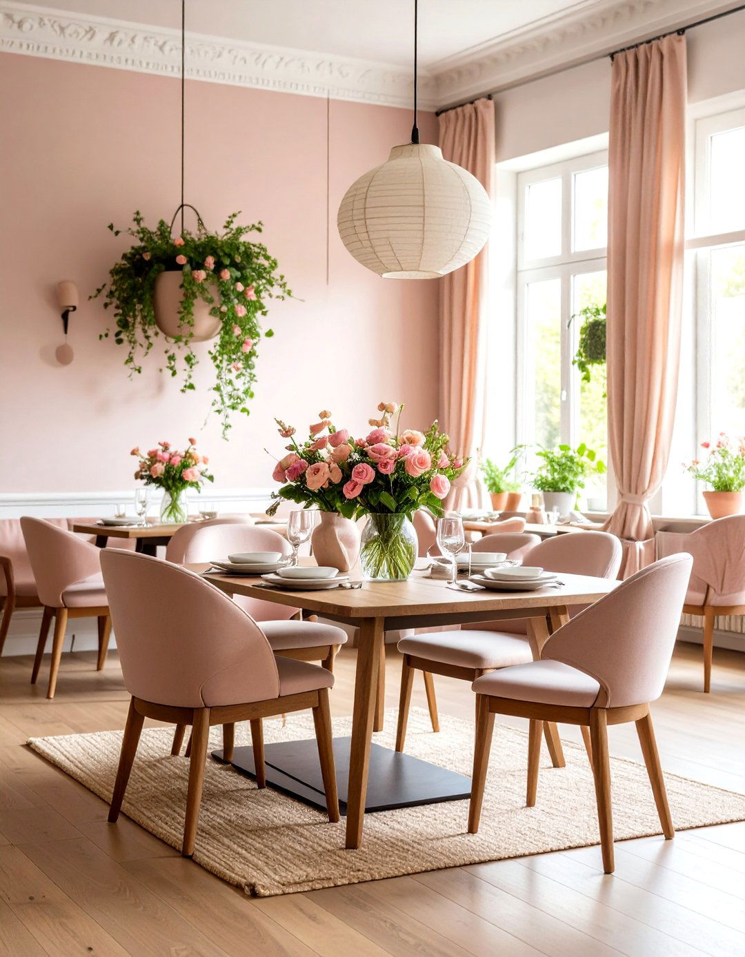
Unlike starker neutrals, Valspar’s Cream in My Coffee off-white paint (3003-10C) leans beige-latte, making north-facing dining rooms feel sun-kissed even on gray days. Its moderate LRV means candles and sconces glow rather than glare, perfect for lingering meals. Complement with walnut tables and iron legs to echo the color’s roasted undertone, or modernize with dusty rose cushions. Because the shade contains enough depth, fingerprints hide better than on higher-LRV whites — handy for busy households.
13. Chantilly Lace Off-White Paint: Minimalist Purity
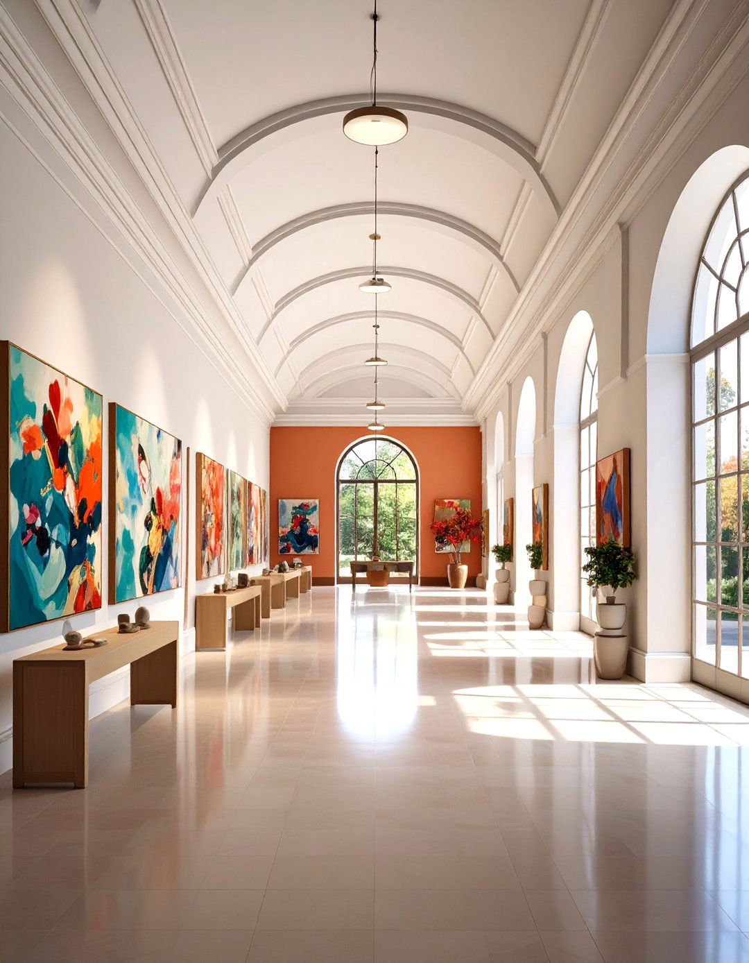
Studies show homeowners gravitate toward Benjamin Moore’s Chantilly Lace off-white paint (OC-65) when they want gallery-clean walls that still feel livable. With almost no visible undertone, it pairs seamlessly with every palette, from bold jewel-tones to earthy terracottas. Use it to frame statement art or as a trim against deeper accent walls for crisp contrast. Because such a bright neutral can reveal surface flaws, sand walls meticulously and consider a flat finish on ceilings to hide minor imperfections.
14. Greek Villa Off-White Paint: Sunlit Serenity
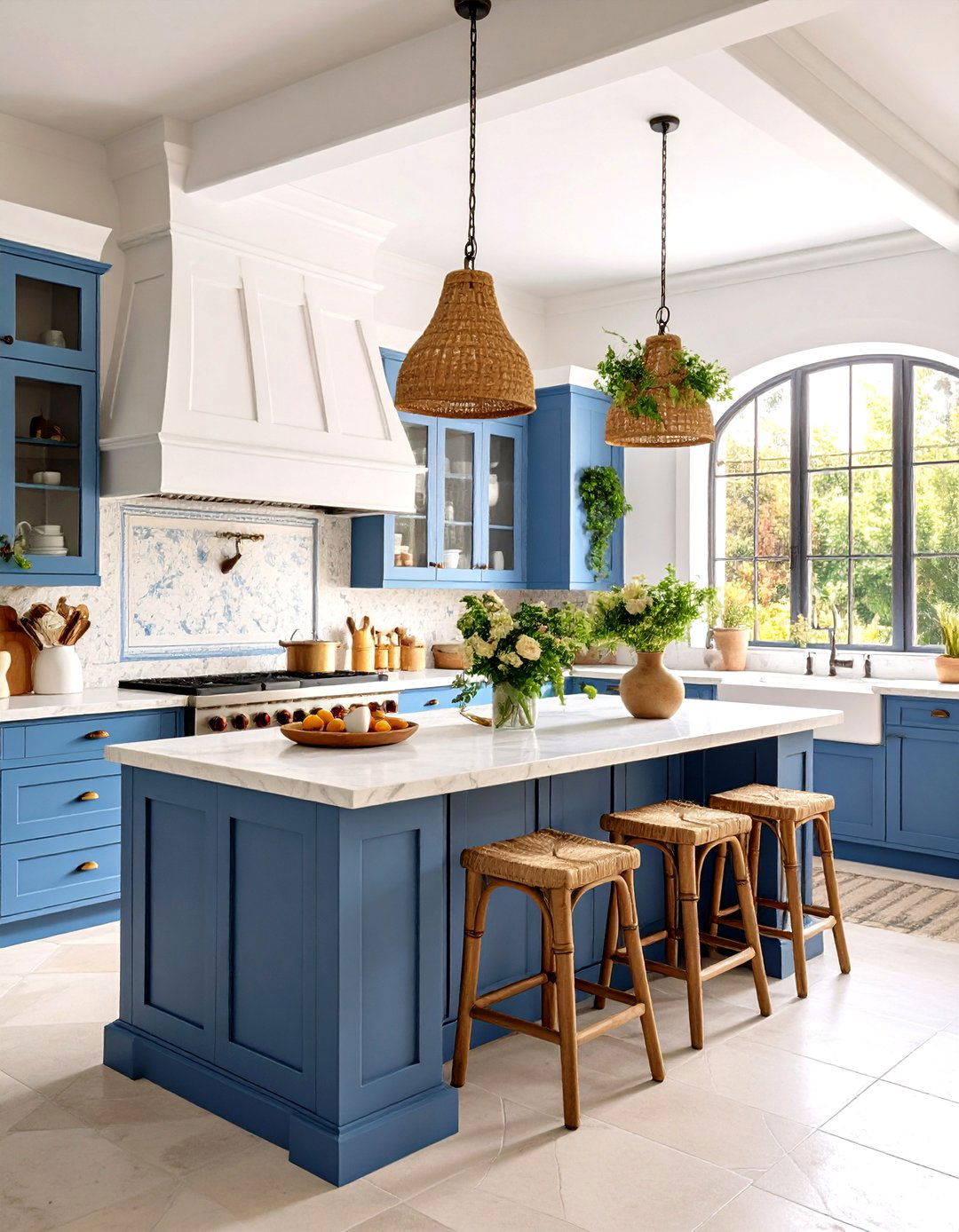
By introducing a kiss of yellow, Sherwin-Williams’ Greek Villa off-white paint (SW 7551) radiates Mediterranean warmth without tipping tan. It’s beautiful for kitchen cabinets paired with honed marble, echoing villa kitchens. In bedrooms, layer flax-colored linens and woven jute to play up its earthy undertone. The hue handles varied lighting well, but in fluorescent offices it may appear warmer — balance with cool metal desk lamps. For cohesive trim, drop sheen to satin in the same formula; undertone stays identical for a built-in look.
15. Off-White No. 3 Paint: Timeless Chalky Depth
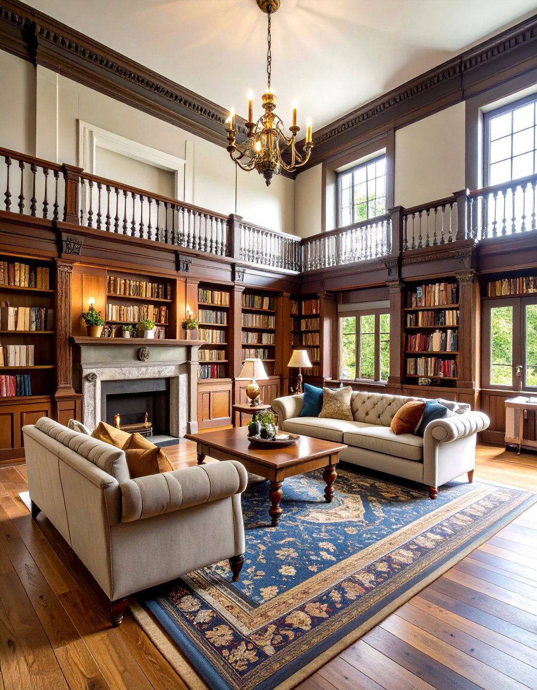
Consider Farrow & Ball’s simply named Off-White off-white paint (No. 3) for Georgian-inspired wainscots or library shelves. A gentle green thread yields a quiet, chalk-soft neutrality that flatters vintage brass or stone hearths. Because it’s calmer than bright gallery whites, fabrics from tweed to velvet feel richer against it. Use Dead Flat on paneling to mask brush marks, then apply eggshell on trim for subtle reflectivity. Pair with Slipper Satin on ceilings for a harmonious, period-authentic scheme.
16. Wimborne White Off-White Paint: Classic Softness
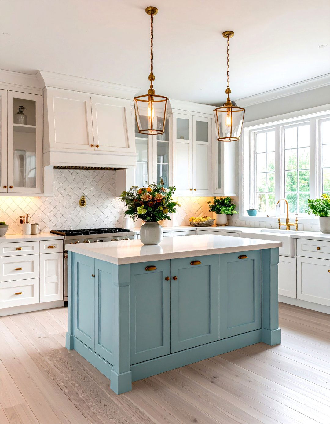
When you crave a whisper of warmth rather than overt cream, Farrow & Ball’s Wimborne White off-white paint (No. 239) delivers. A trace of yellow lifts gloom yet keeps modern edge. Interior designers often specify it for kitchen walls so cabinetry colors pop without discord. Try it with brushed brass pulls and zellige backsplashes for artisanal charm. Because its pigments are rich, two light coats usually suffice; however, priming with the brand’s White & Light Tones undercoat locks undertone integrity.
17. Neutral Ground Off-White Paint: Balanced Backdrop
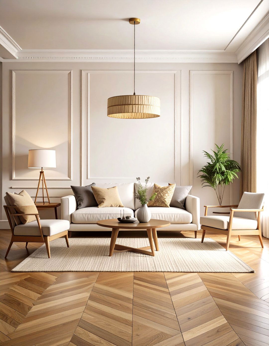
What happens when beige meets white? Sherwin-Williams Neutral Ground off-white paint (SW 7568) emerges — a versatile bridge color with subtle tan that curbs starkness. It’s ideal for blending honey-oak floors into updated furniture, preventing clashing undertones. In open layouts, use it on walls and shift to Alabaster on ceilings for gentle delineation. Because it leans warm, pair hardware in antique bronze or oil-rubbed bronze to reinforce cozy vibes rather than fight them.
18. Seapearl Off-White Paint: Misty Coastal Note
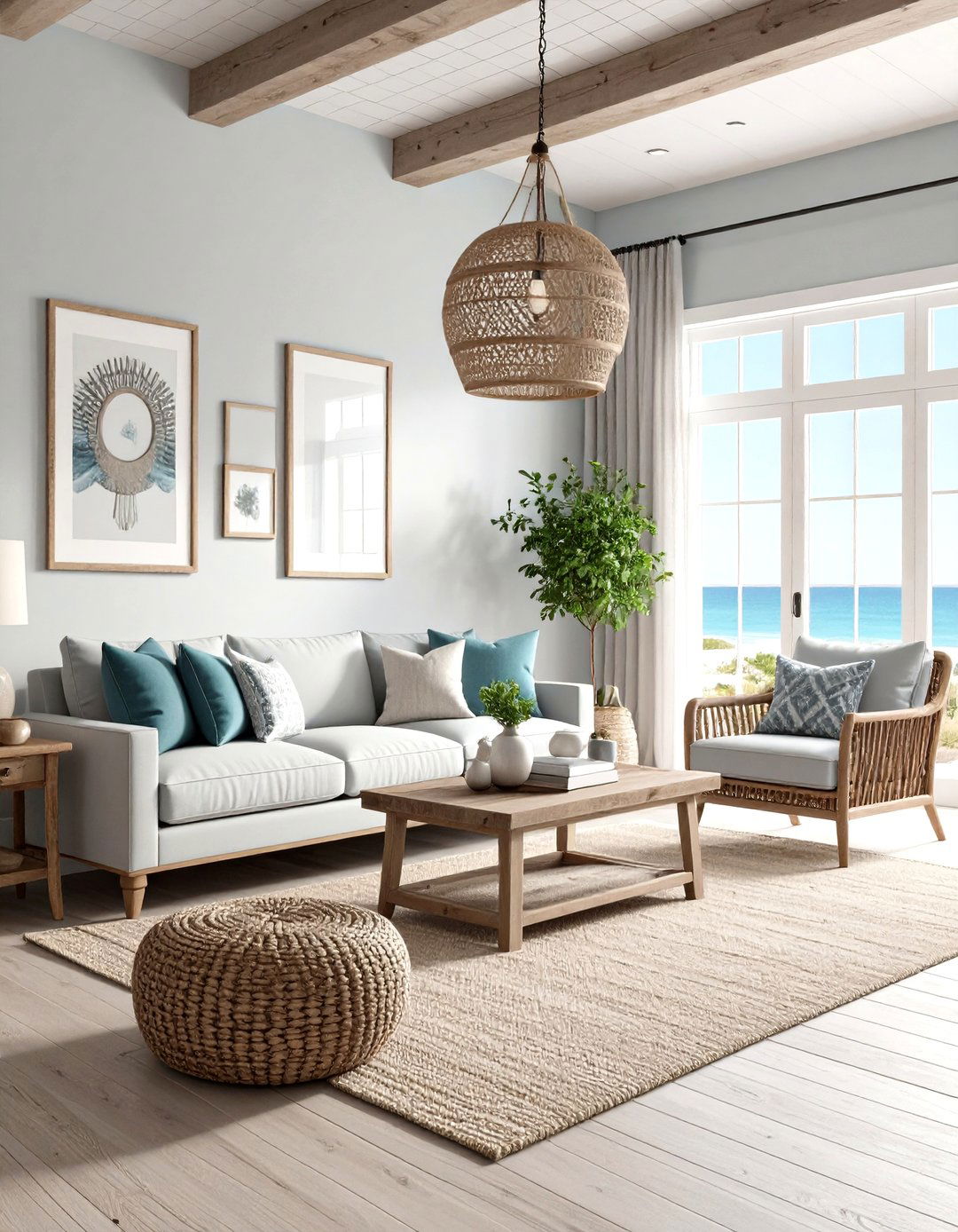
For a whisper of cool gray, Benjamin Moore’s Seapearl off-white paint (OC-19) evokes fog rolling over dunes. Its 76 LRV is lower than many whites, so bright south-facing rooms won’t feel overexposed. Try it on board-and-batten accent walls to highlight shadow play, then accent with driftwood frames. The hue’s neutrality means both warm brass and cool chrome mesh, giving homeowners freedom to mix metals without clashing.
19. Silky White Off-White Paint: Fresh Linen Feel
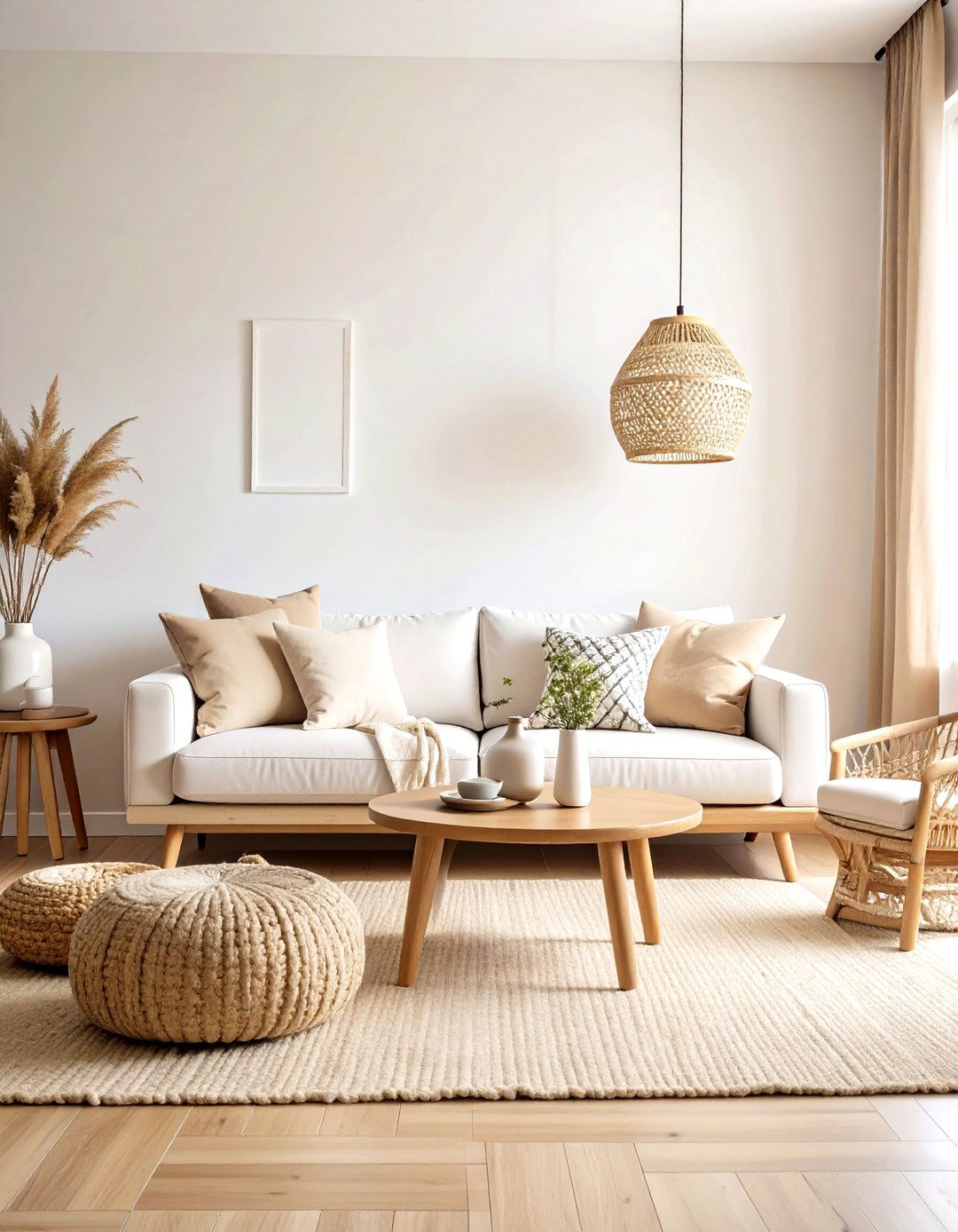
With echoes of crisp cotton sheets, Behr’s Silky White off-white paint (PPU7-12) offers a neutral that reads clean yet soothing. Because it sits mid-range on the warmth scale, it adapts to cool LEDs or warm incandescents alike — great for multipurpose family rooms. Apply a washable matte to walls for kid-friendly durability, pairing with sandy throw pillows to draw out its gentle beige undertone. The color also shines on furniture makeovers; a Silky White dresser anchors colorful nursery décor without overpowering playful accents.
20. Slipper Satin Off-White Paint: Ballet-Inspired Grace
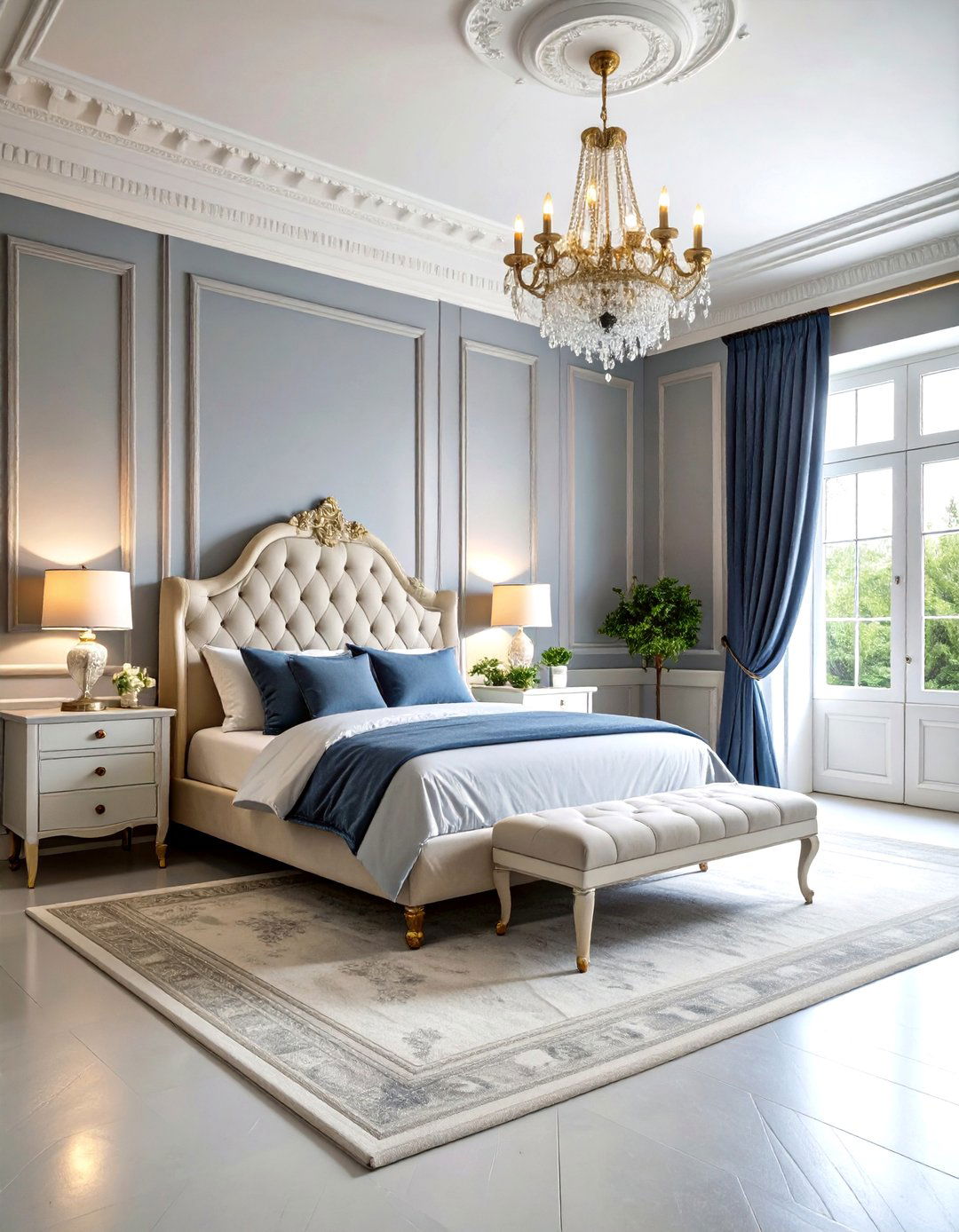
Bringing a hint of pale gray chalk, Farrow & Ball’s Slipper Satin off-white paint (No. 2004) references ballet slippers, adding refined softness to bedrooms. In north-light it skews greige, masking pet hair and everyday smudges better than brighter whites. Try Estate Emulsion on walls for a velvety backdrop, contrasting with White Dove trim to emphasize mouldings. Because undertones shift subtly, always position swatches beside fabrics to confirm harmony before committing.
21. Dover White Off-White Paint: Sun-Splashed Welcome
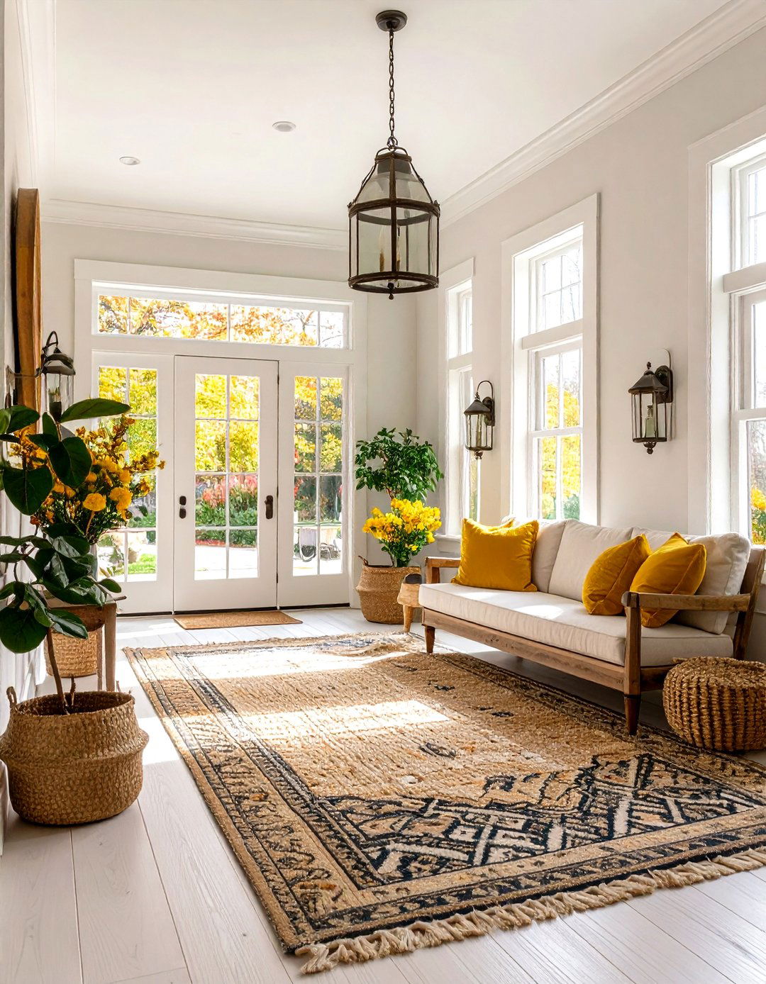
A breezy, sunlit vibe radiates from Sherwin-Williams Dover White off-white paint (SW 6385) thanks to its soft yellow core. It excels in foyers, creating a hospitable first impression beside natural-fiber rugs and aged brass lanterns. If your space uses lots of cool grays, Dover may read peachy — balance with black metal stair spindles for contrast. Opt for satin on millwork; the extra sheen highlights architectural details while maintaining the color’s airy warmth.
22. Navajo White Off-White Paint: Desert Warmth
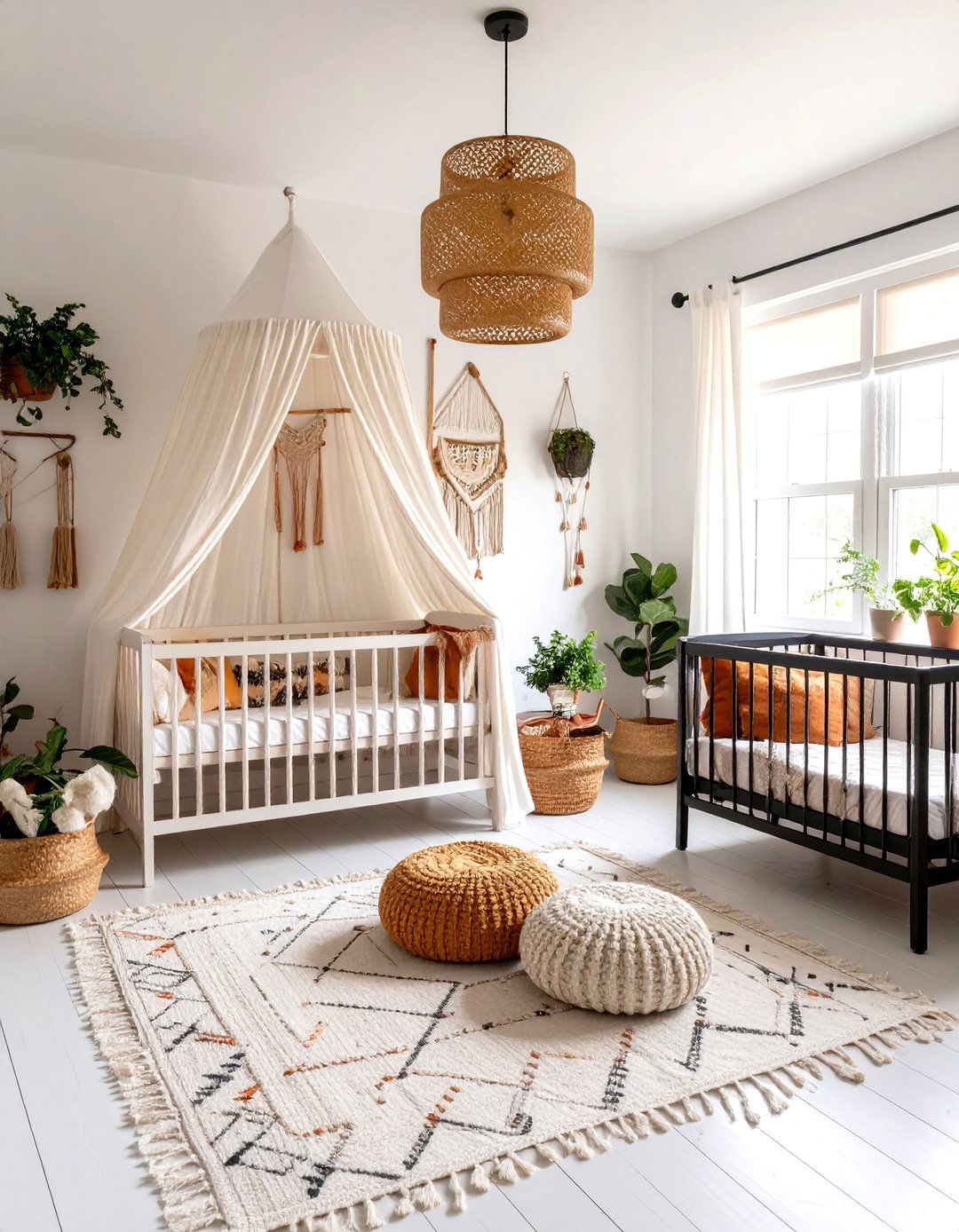
Inspired by sun-bleached adobe, Benjamin Moore’s Navajo White off-white paint (OC-95) brings subtle desert richness indoors. Touches of tan keep it cozy under LED light, making it popular for nurseries and rental properties alike. Pair with terracotta pots, kilim cushions, or black iron beds for Southwest flair. Because it leans warm, avoid pairing with cool blue-gray tiles unless you want active contrast; instead, lean into earthy palettes for a seamless flow.
23. Gypsum Off-White Paint: Veiled Gray Gentleness
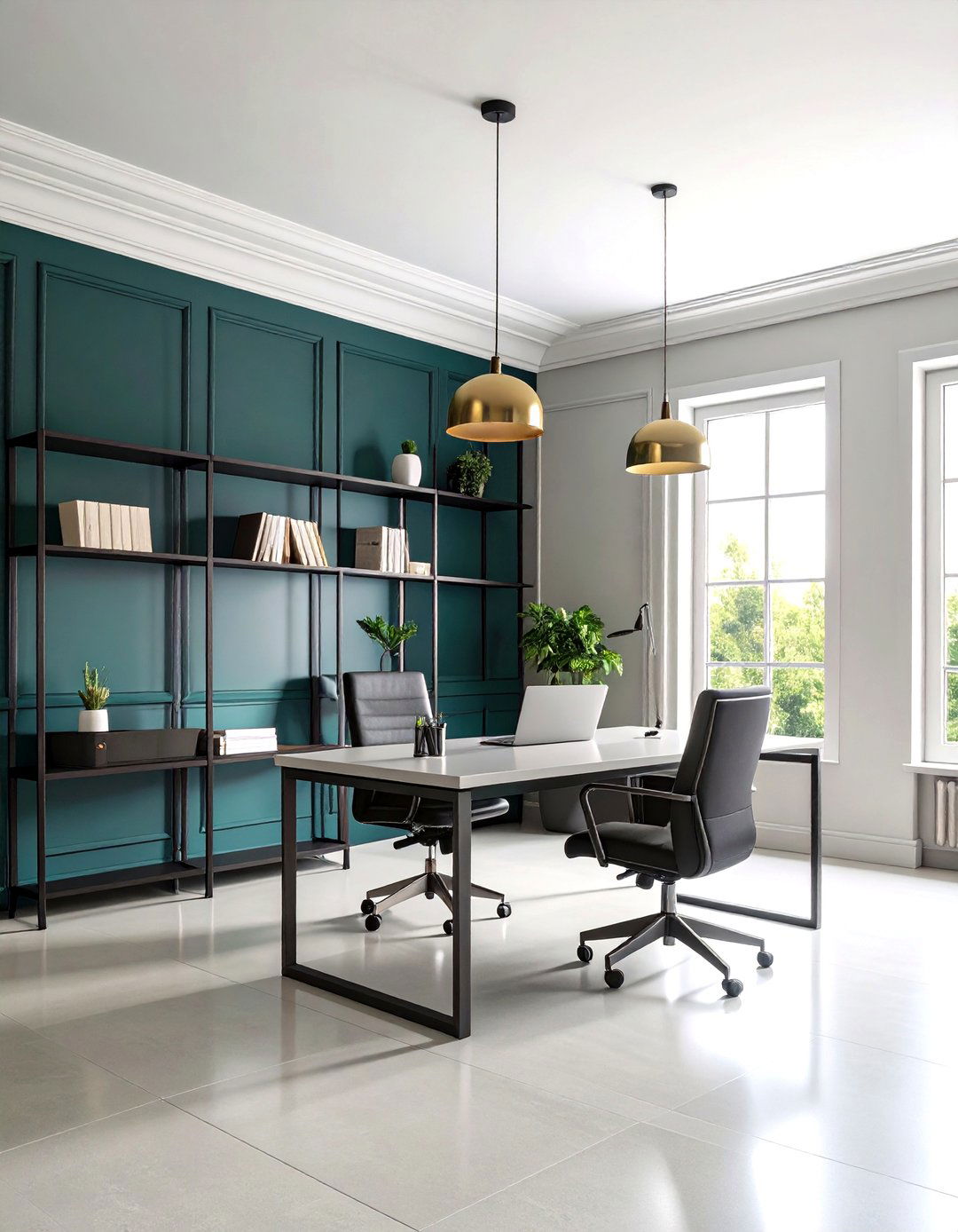
PPG’s Gypsum off-white paint (PPG 1006-1) features a veil of gray plus a whisper of red, yielding a sophisticated neutral that sidesteps sterile. It’s perfect for offices where concentration rules — cool enough to reflect daylight yet warm enough to prevent eye strain. Coordinate with deep green wainscoting for a nature-inspired palette, or keep things monochrome with black metal shelving. Because Gypsum has mid-level reflectance, mark-ups from chair backs stay discreet, an unheralded perk in busy workspaces.
24. Whipped Off-White Paint: Soft Bakery Bright
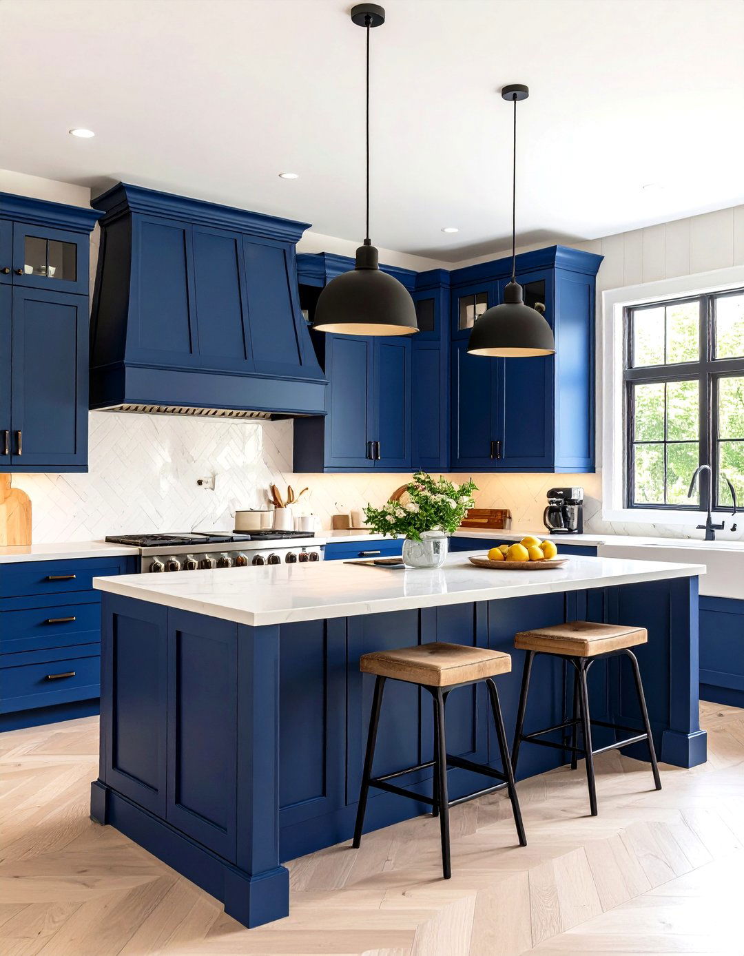
Take, for instance, Clare Paint’s Whipped off-white paint, the brand’s best-selling neutral touted for its delicate, creamy warmth that flatters every skin tone. It excels in north-facing rooms that can feel icy with cool whites, delivering a hint of sweetness without sugary yellow. Pair it with matte black fixtures for bakery-chic kitchens, or contrast with navy cabinetry for coastal charm. Because Clare ships peel-and-stick swatches, you can test undertones quickly across walls and cabinets before committing.
25. Eider White Off-White Paint: Modern Gray Whisper
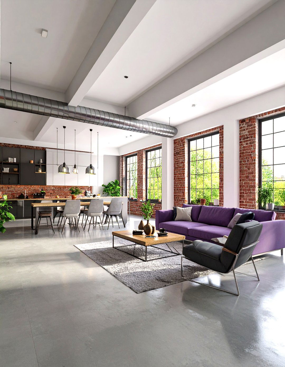
Finally, Sherwin-Williams Eider White off-white paint (SW 7014) supplies a restrained gray-violet note that modernizes open lofts. Its muted character tempers bright daylight, letting industrial brick, concrete floors, or chrome fixtures shine. Use a flat sheen on ceilings to disguise ductwork shadows, then shift to eggshell on drywall for easy cleaning. If the space includes red brick, Eider’s violet hint harmonizes rather than clashes, creating a curated, monochrome loft aesthetic.
Conclusion:
Selecting the right off-white paint is less about chasing a “one-size-fits-all white” and more about matching undertones, lighting, and lifestyle to a hue’s subtle character. From the creamy calm of Alabaster and Swiss Coffee to the gray-kissed poise of Snowbound and Eider White, each shade offers a unique path to warmth, brightness, or modern edge. Sampling your top contenders in real room light remains indispensable; a simple swatch can reveal whether Cloud White’s lift or Seapearl’s misty cool truly sings. Use these 25 expert-vetted options as a springboard, and you’ll paint rooms that feel effortlessly inviting for years to come.




Leave a Reply