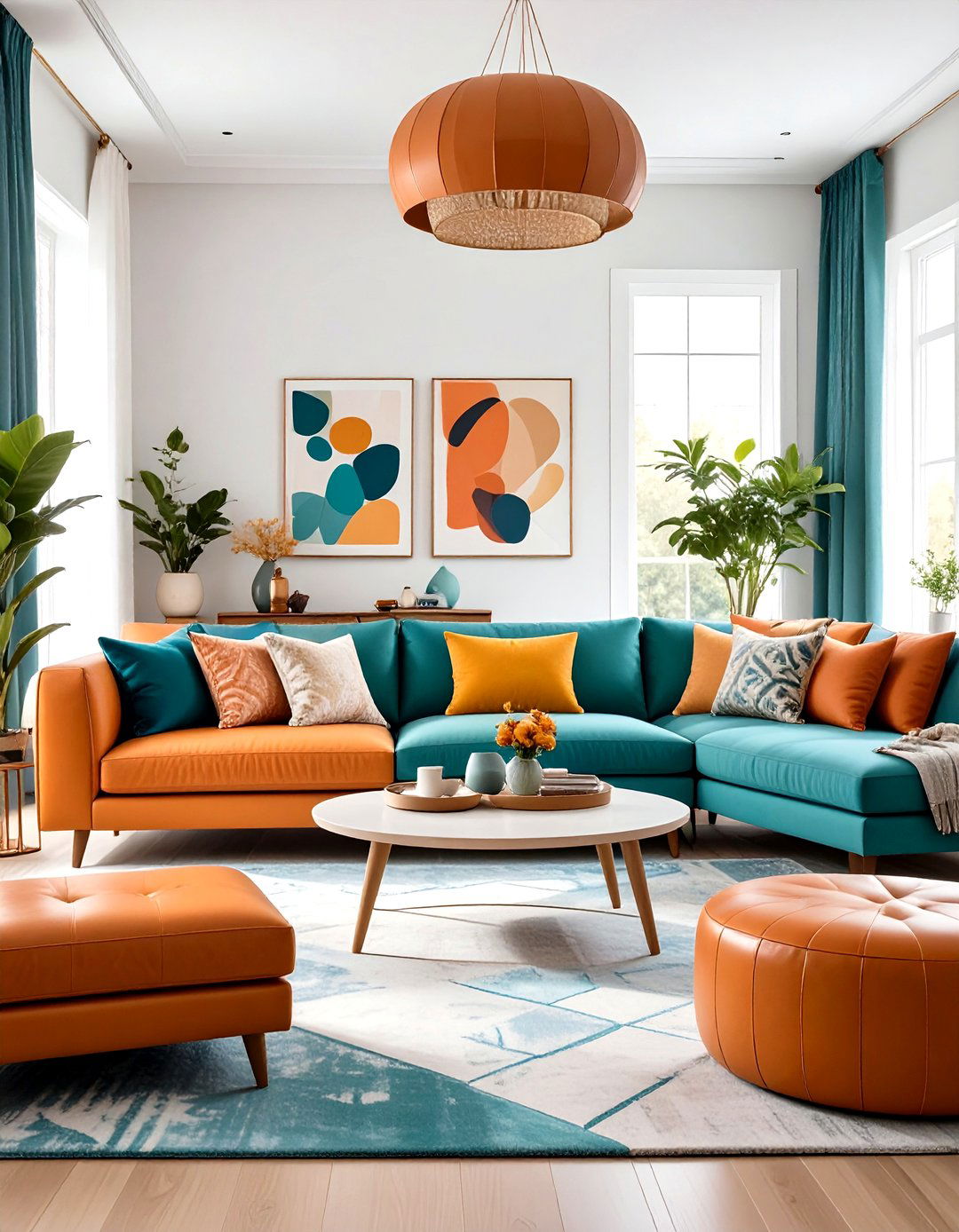
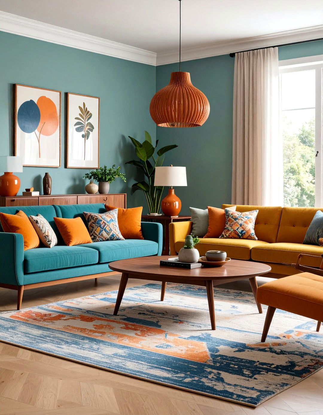
Orange ignites conversation while blue settles the pulse, so when the two meet in a living room the space hums with equal parts energy and calm. Designers love the duo because they sit opposite each other on the color wheel, meaning they naturally sharpen one another’s best qualities without clashing. Blue’s cool undertone reins in orange’s exuberance, and orange lifts blue out of potential chilliness, giving you an inviting interior that still feels fresh. Below are 25 actionable ways to let that vibrant chemistry shine, whether your taste veers modern, coastal, or delightfully eclectic.
1. Anchor With a Complementary Color-Wheel Base
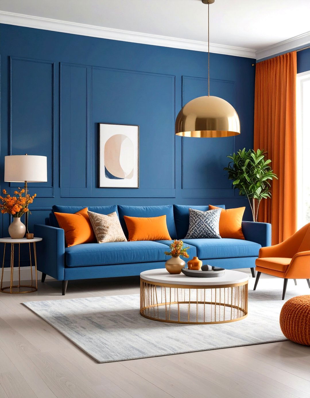
A simple way to launch an orange and blue living room is by painting walls a serene denim or powder blue, then sprinkling tangerine accents throughout. Because the colors are complementary, the blue backdrop instantly amplifies every orange cushion, vase, and lampshade you add. Keep the floor neutral so the palette reads intentional, not chaotic. Finish with metallics — brass works beautifully — to bounce light around the room and prevent either hue from feeling flat.
2. Let Neutrals Do the Heavy Lifting
When you crave color but fear commitment, start with an off-white sofa, sandy rug, and pale oak tables. Now introduce a single burnt-orange loveseat and a sapphire side chair. The Better Homes & Gardens team notes that a neutral envelope lets even small doses of orange and blue sing without visual overload. Echo each tone in artwork or book spines so the bright pieces feel woven into the architecture rather than tacked on.
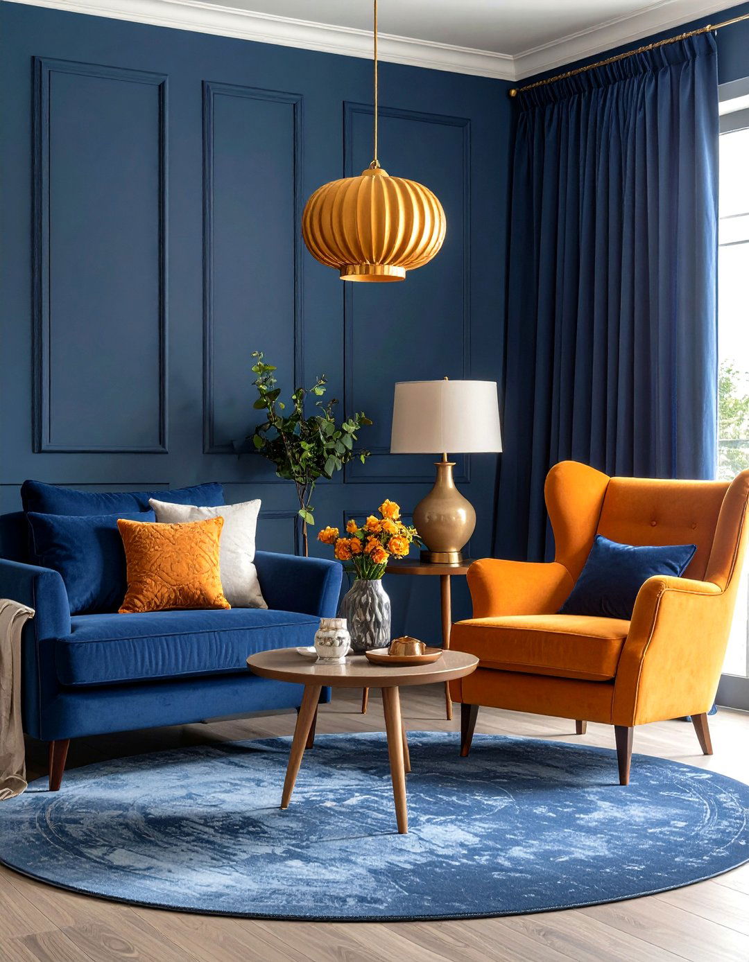
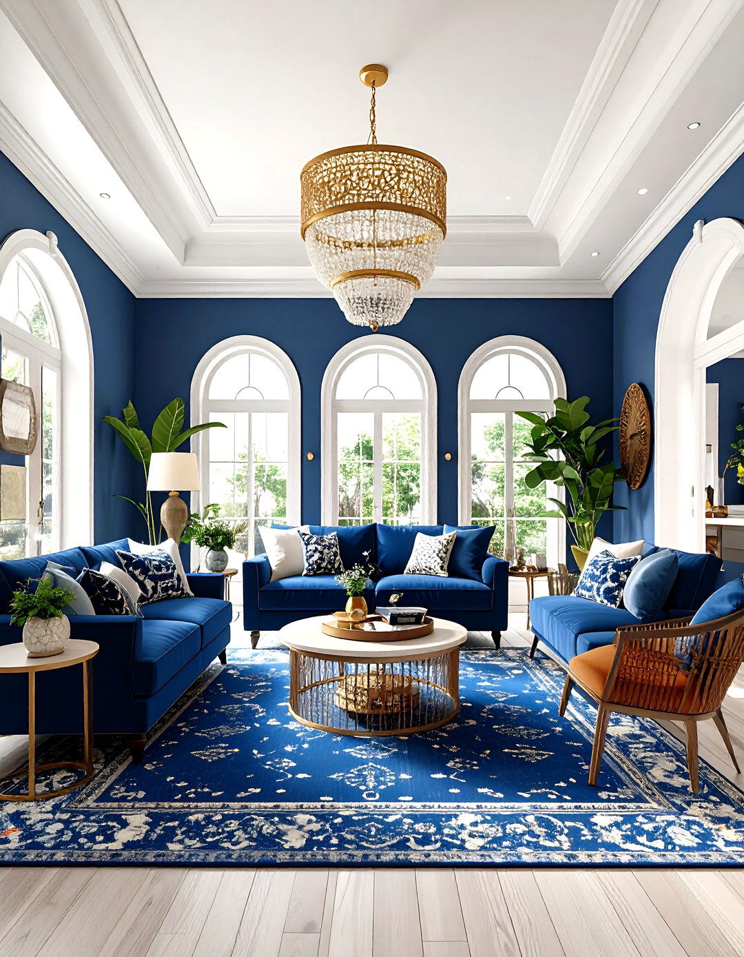
3. Embrace Navy and Burnt Orange for Grown-Up Glam
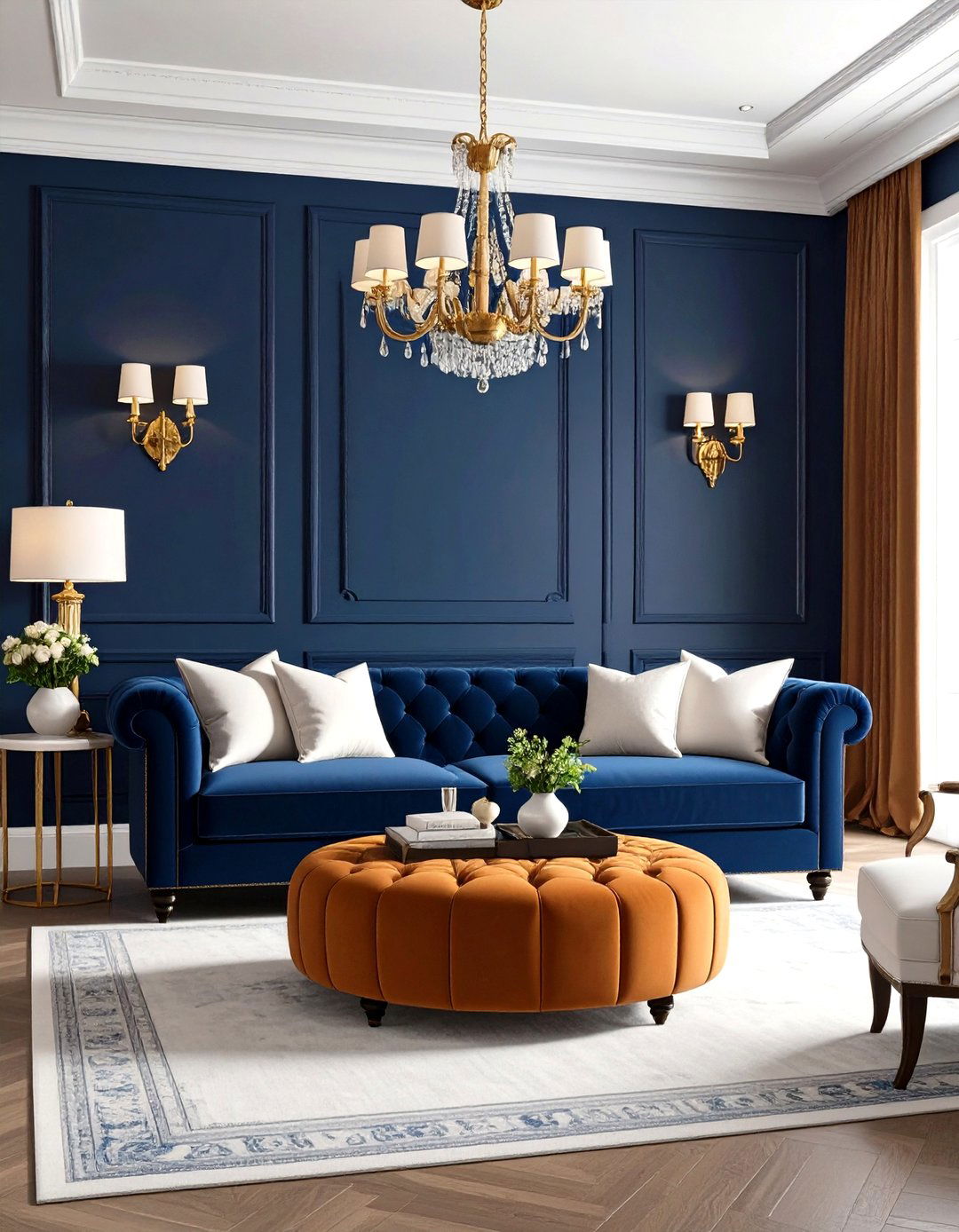
Deep navy walls paired with a cognac-orange ottoman instantly telegraph sophistication. Because both shades contain enough black to feel muted, the overall vibe is luxe, not loud. Lift the scheme with crisp white trim and a glint of gold on sconces. The contrast is dramatic yet perfectly livable for a formal lounge or library-style living room.
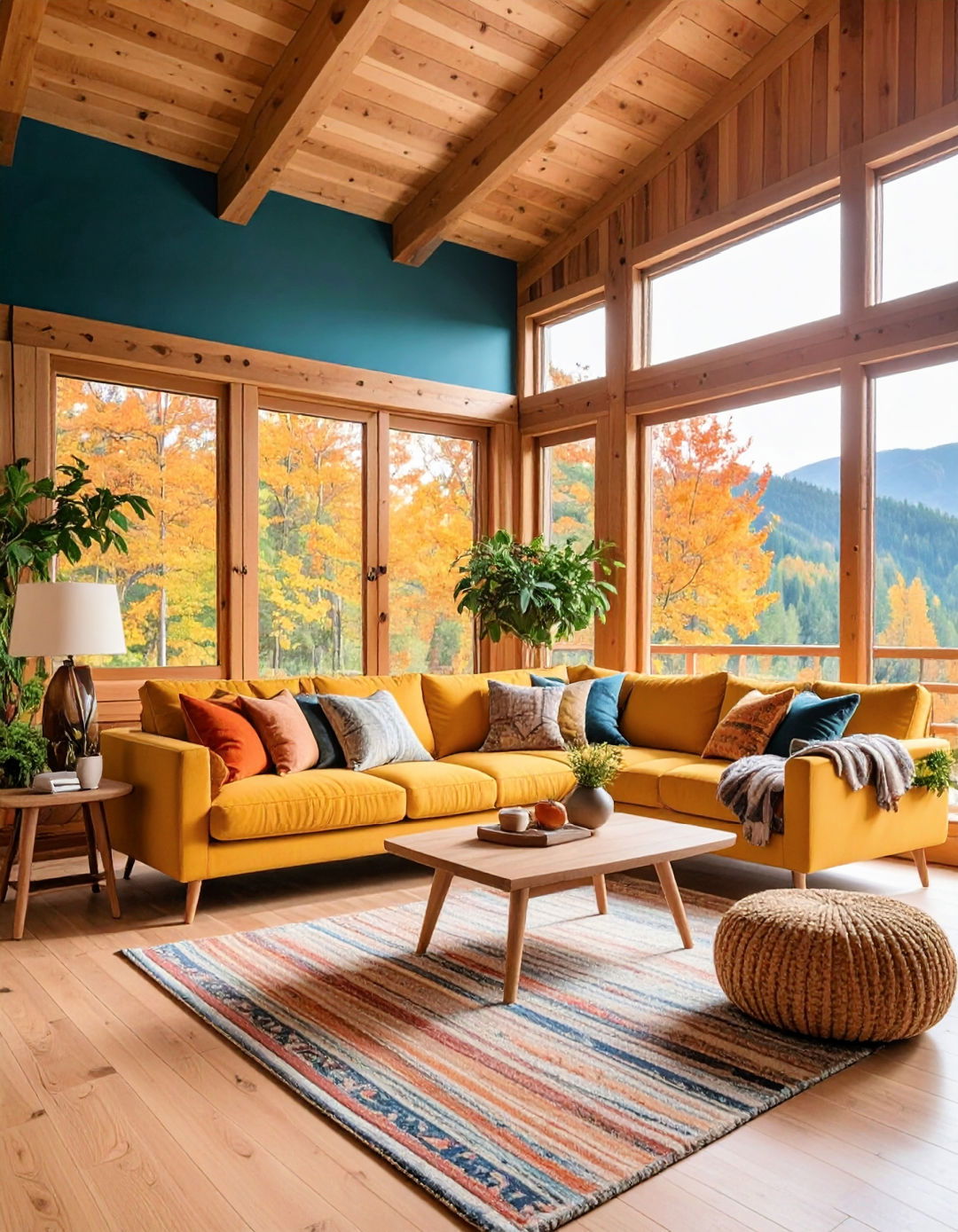
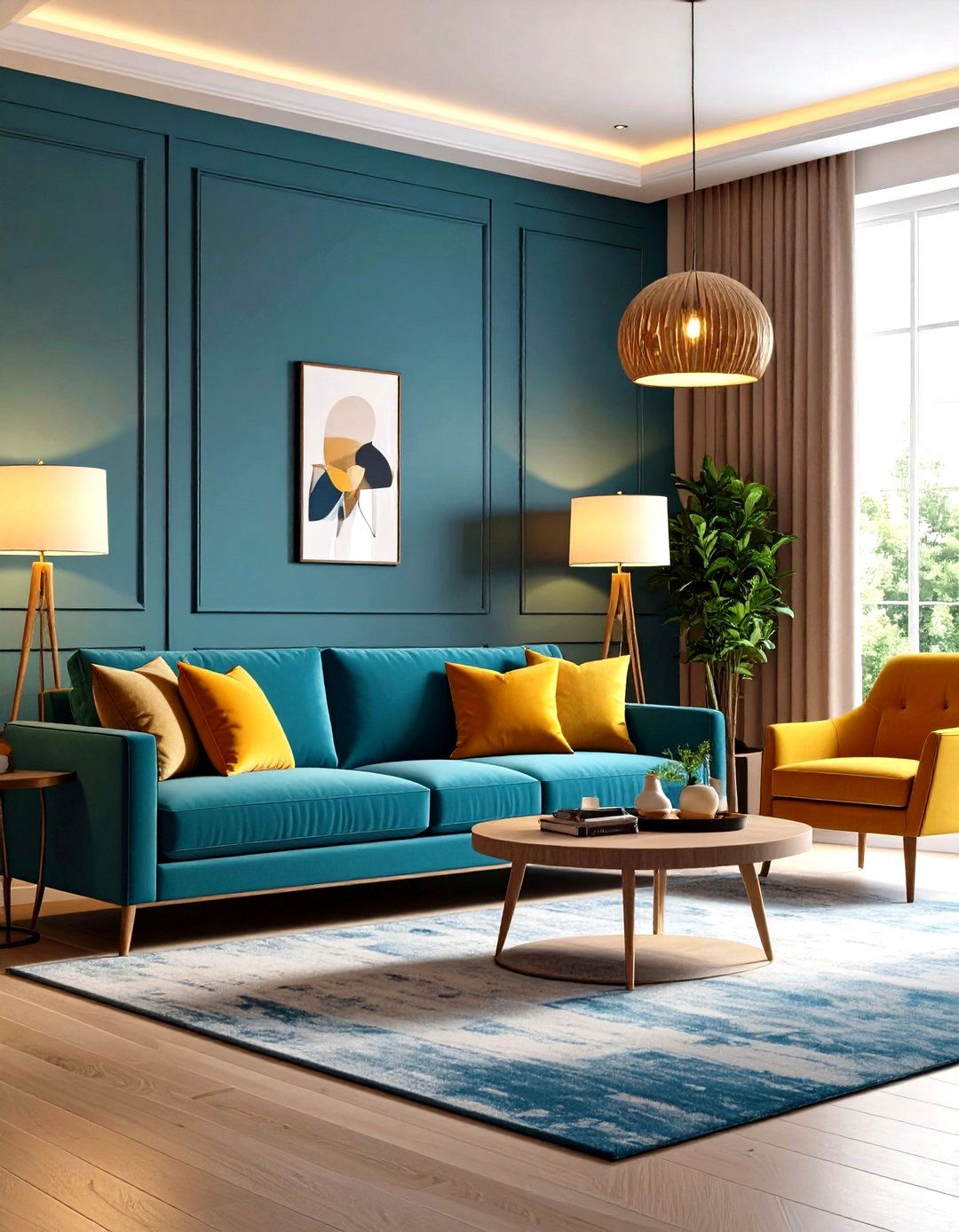
4. Channel Mid-Century Modern Cool
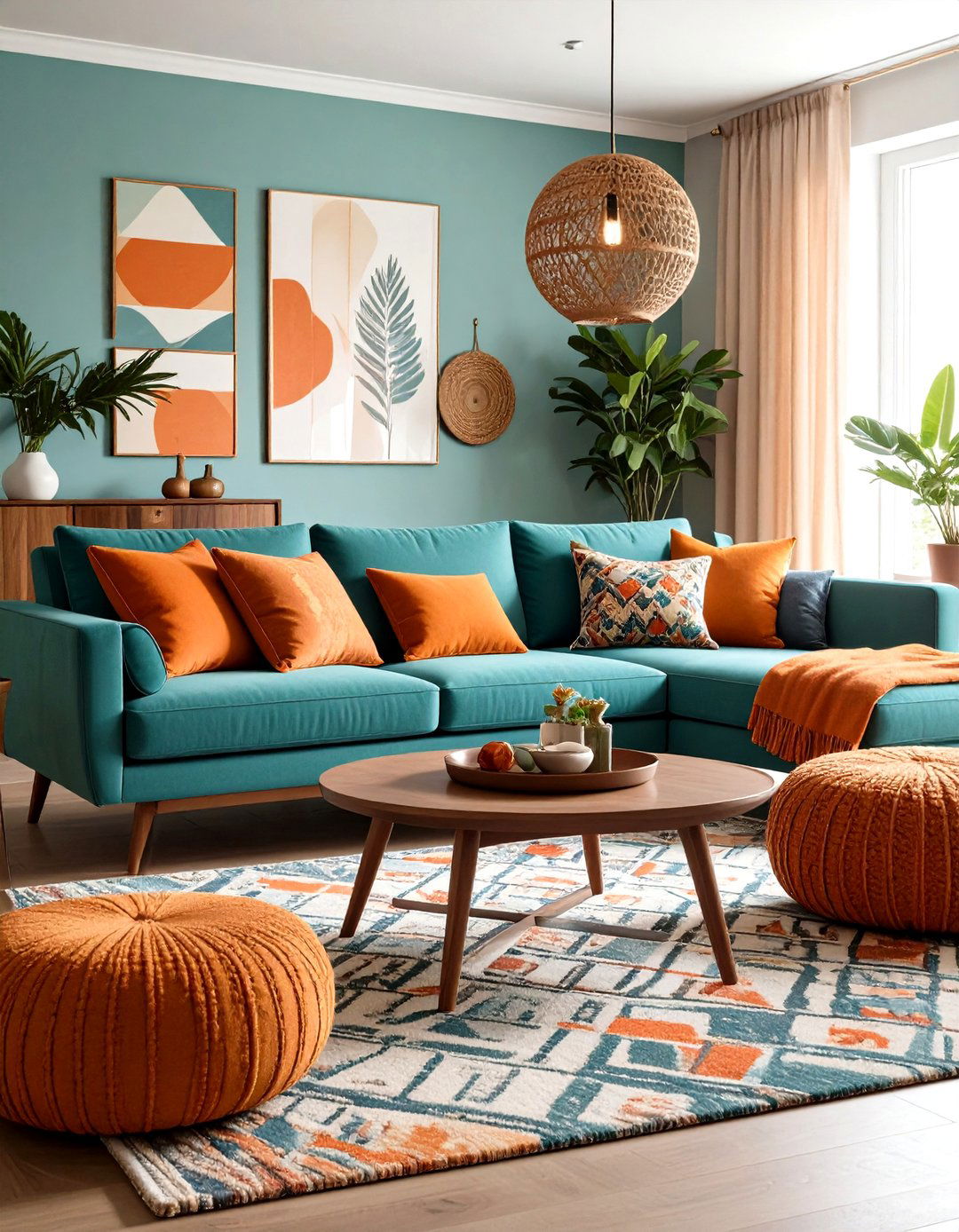
Mid-century palettes loved pairing teal sofas with mod-orange pillows, then grounding everything with walnut furniture. Tapered legs keep sightlines airy while vintage starburst clocks or geometric rugs echo the playful color story. Use the 60-30-10 rule — 60 % neutral wood and white, 30 % blue upholstery, 10 % orange accents — to avoid a retro room that feels like a movie set.
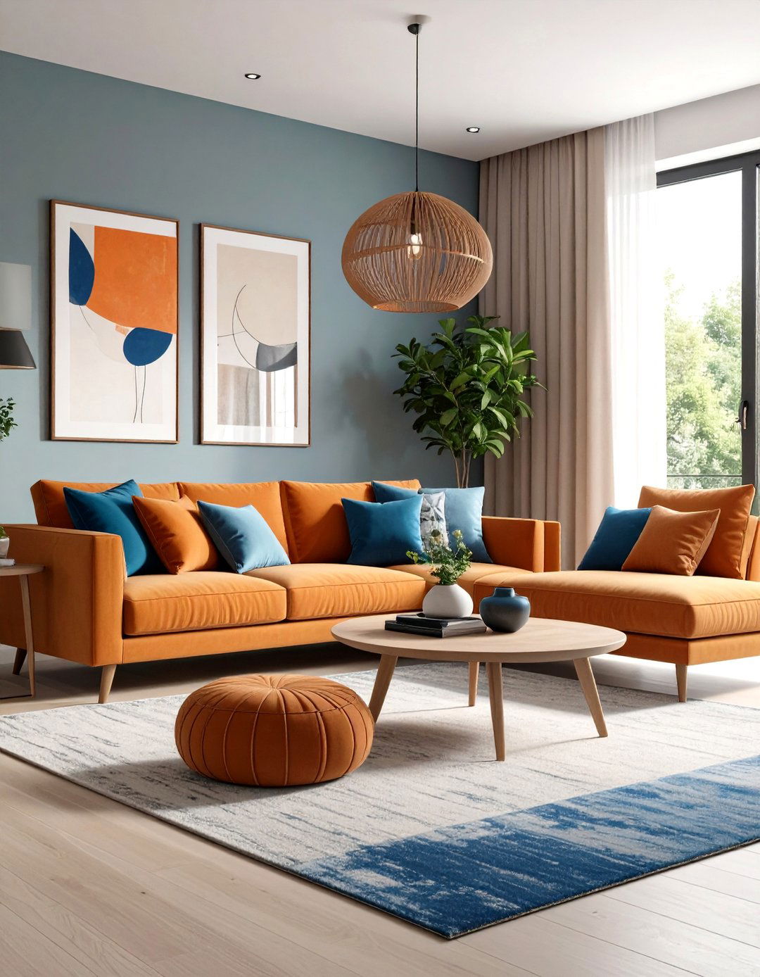
5. Capture a Coastal Breeze With Aqua and Tangerine
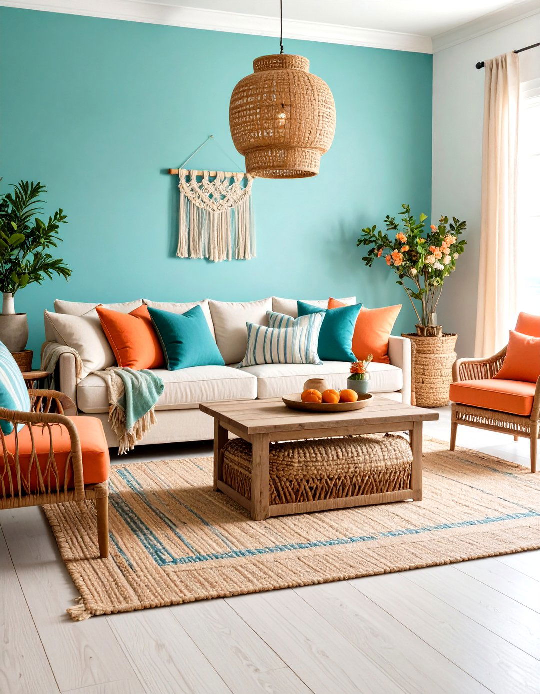
Aqua walls teamed with coral-orange side chairs evoke beach umbrellas against clear water, an HGTV-endorsed combo for breezy coastal living rooms. Anchor the palette with a jute rug and slipcovered sofa so bright hues remain casual. A bowl of driftwood and some navy-striped pillows tie the shoreline narrative together without tipping into kitsch.
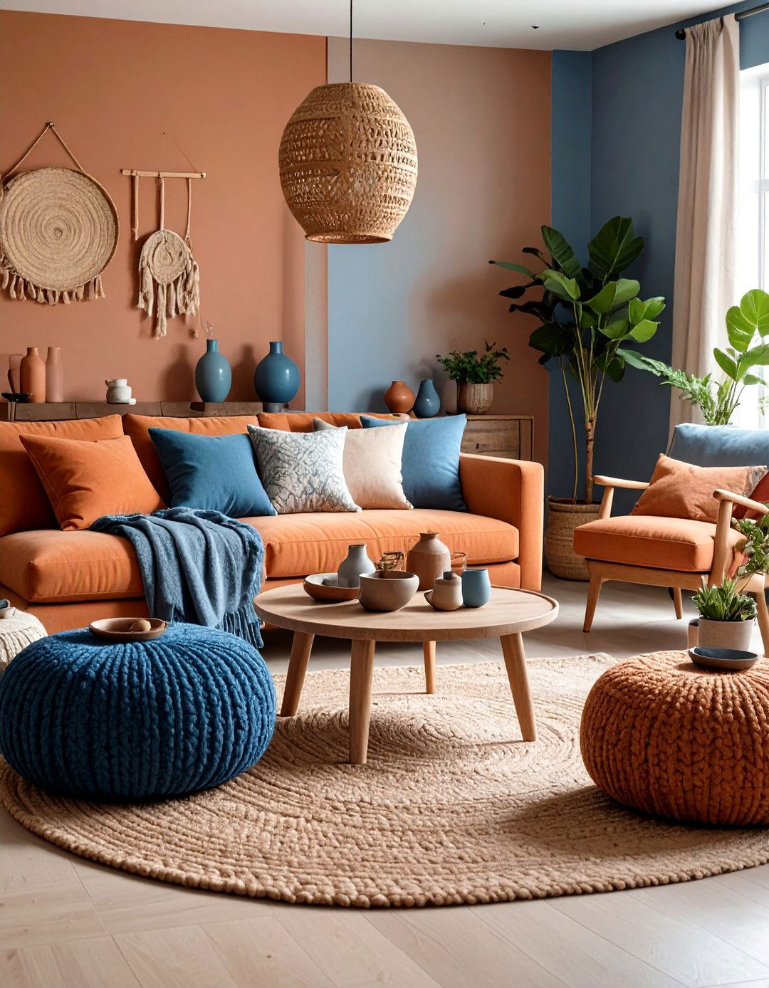
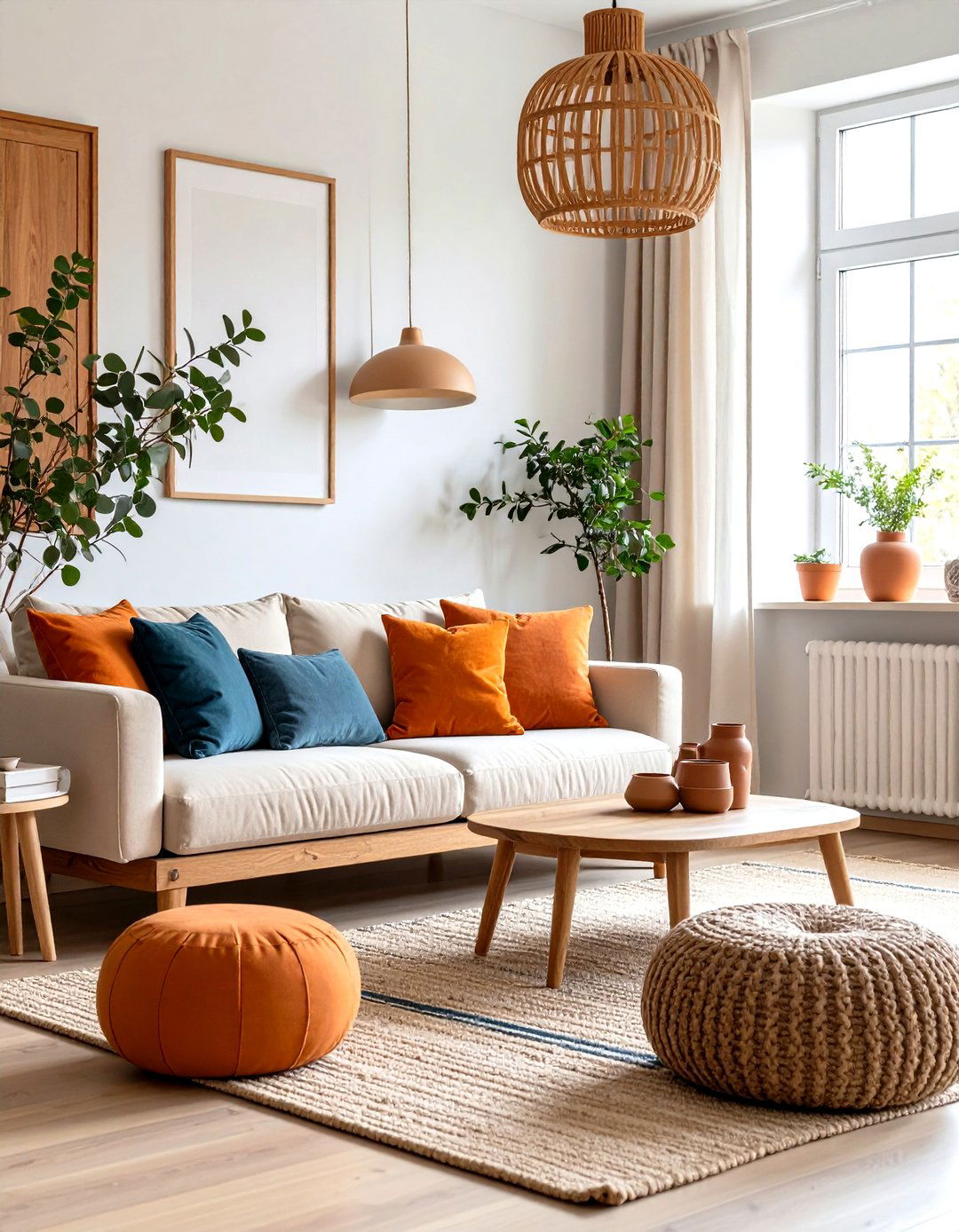
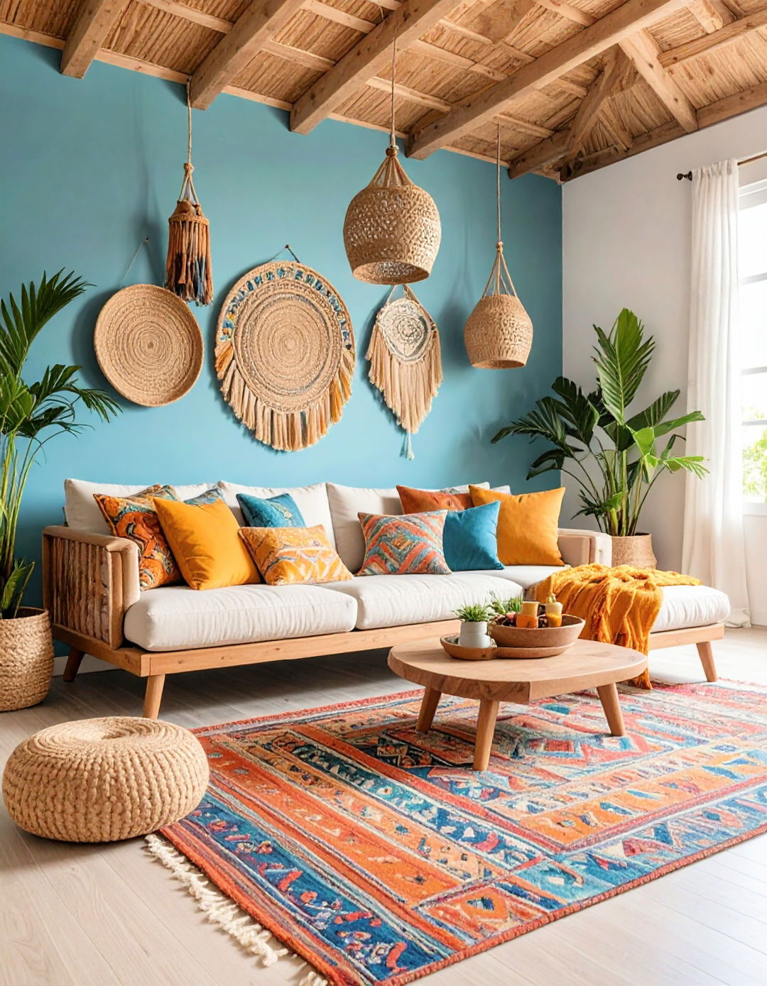
6. Layer Boho Textiles for Global Warmth
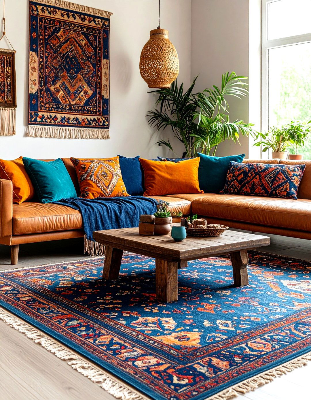
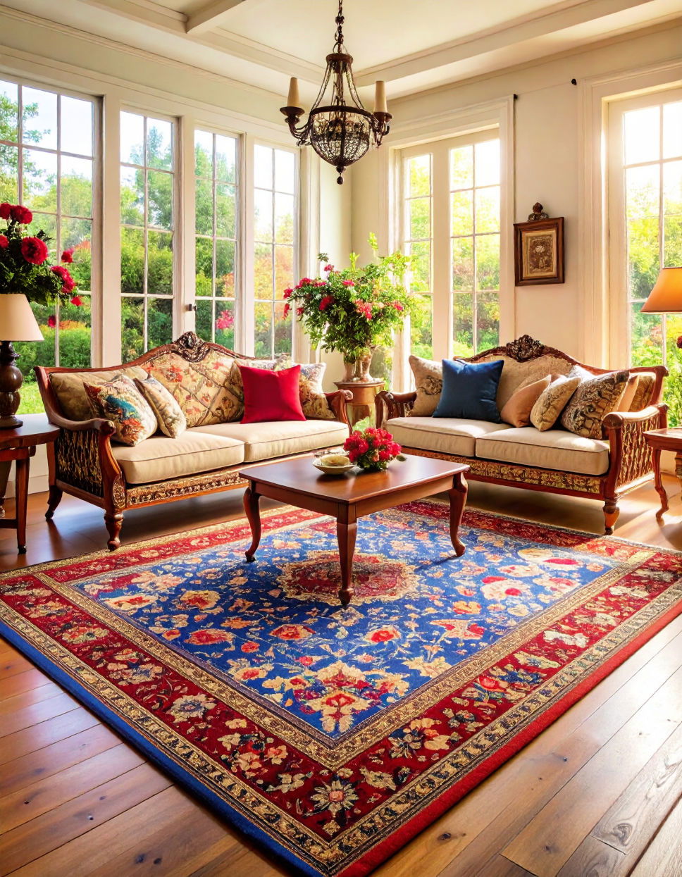
Bohemian rooms thrive on pattern, so drape an indigo mud-cloth throw over a cinnamon leather couch, scatter kilim pillows in shades of rust and turquoise, and lay a low-pile Persian rug underfoot. Plants — especially trailing pothos against terracotta pots — introduce organic green that bridges the orange-blue spectrum and keeps the palette earthy rather than high-contrast electric.
7. Mix Scales of Pattern Fearlessly
Pair a colossal blue-and-white ikat area rug with petite orange herringbone pillows. The eye perceives variety in scale before it notices color, so the differing motifs create cohesion instead of chaos. Repeat each pattern’s less dominant shade elsewhere (for instance, a navy picture frame or tiny burnt-orange vase) to weave the story across the room.
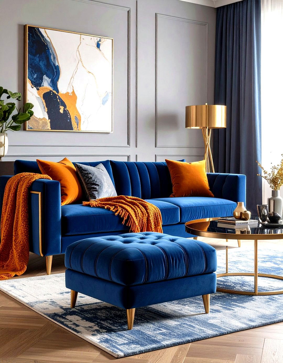
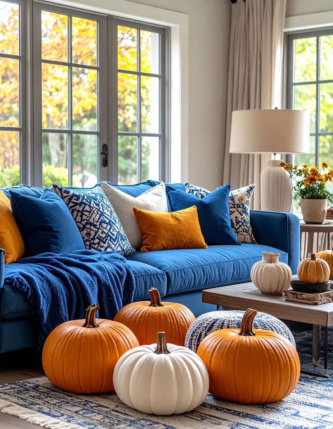
8. Commit With a Statement Sofa
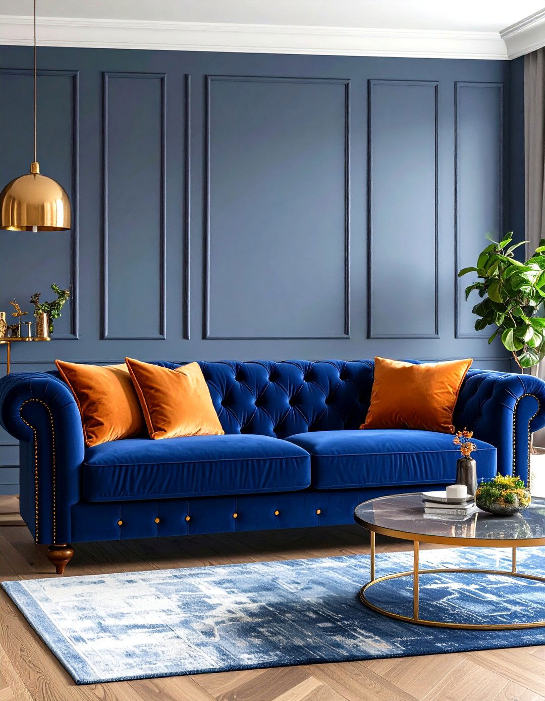
If you’re ready to dive in, upholster the main sofa in vivid royal blue velvet, then pepper it with pumpkin-toned cushions. Velvet’s sheen lets orange piping or contrast buttons catch the light for extra depth — an Architectural Digest tip for making bold color feel plush rather than overwhelming. Keep walls subdued so the sofa rightfully steals the spotlight.
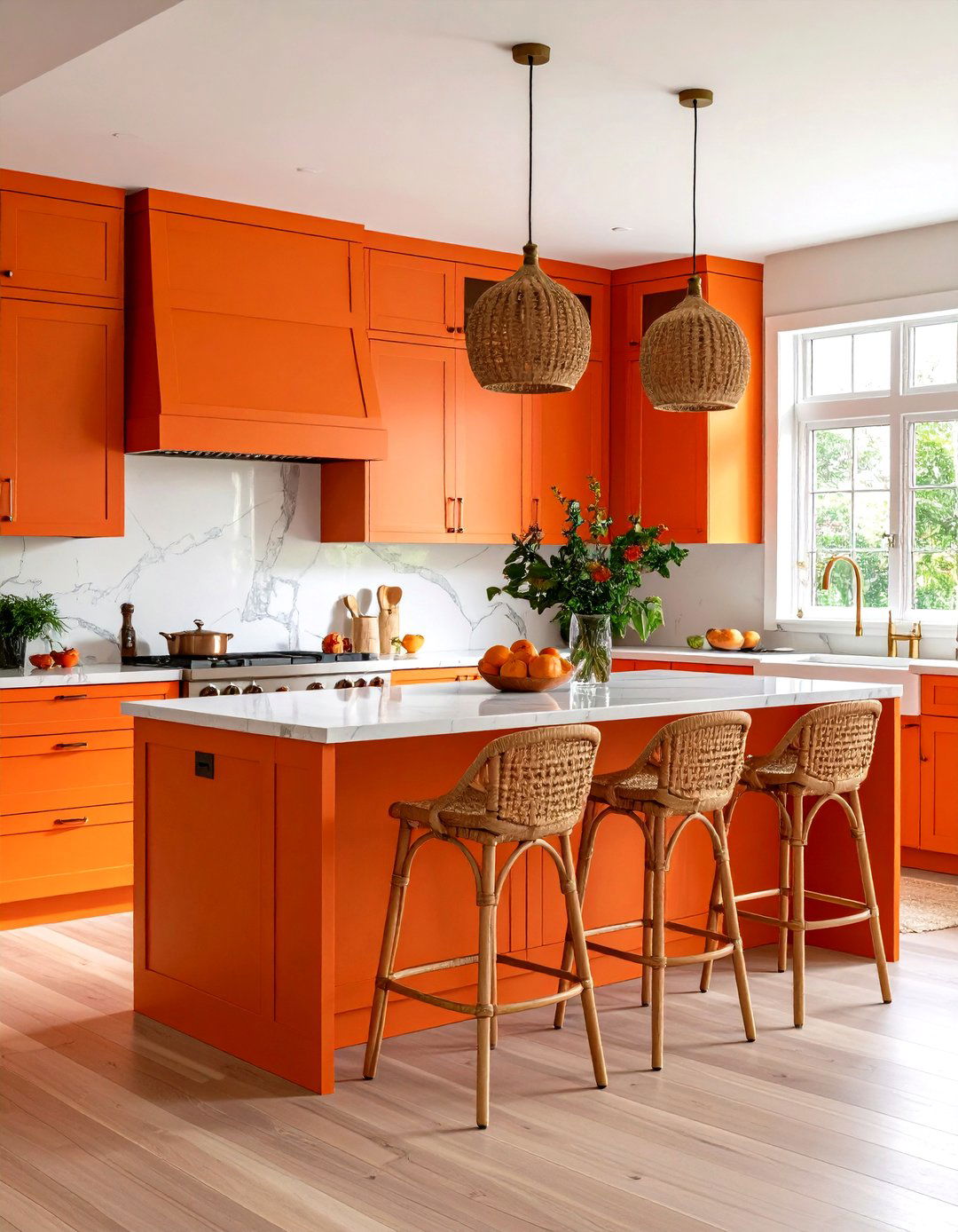
9. Paint One High-Impact Accent Wall
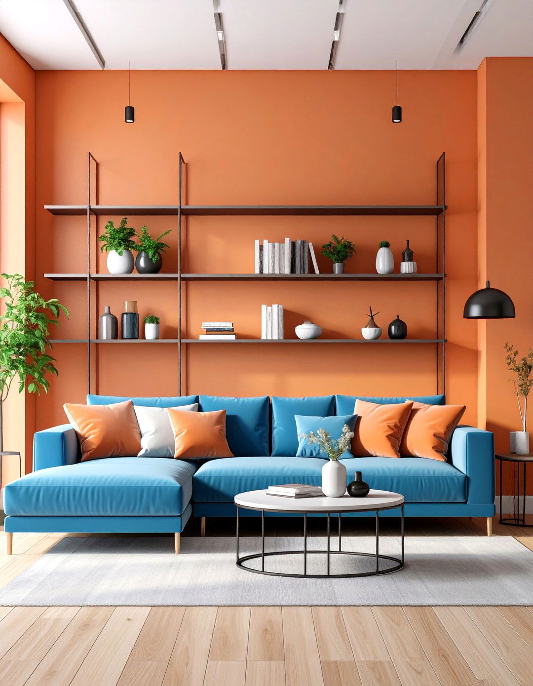
Orange accent walls radiate warmth yet contain their intensity to one plane. Pick a softer persimmon and situate it behind built-in shelves or the TV so you’re not staring at brights all evening. Homes & Gardens suggests tempering that wall with sky-blue décor on adjacent shelving to balance the temperature swing.
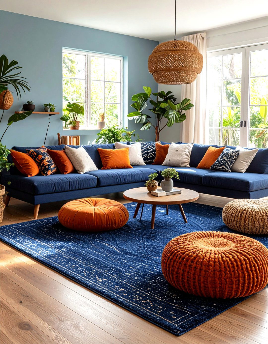
10. Ground the Scheme Around an Oversized Area Rug
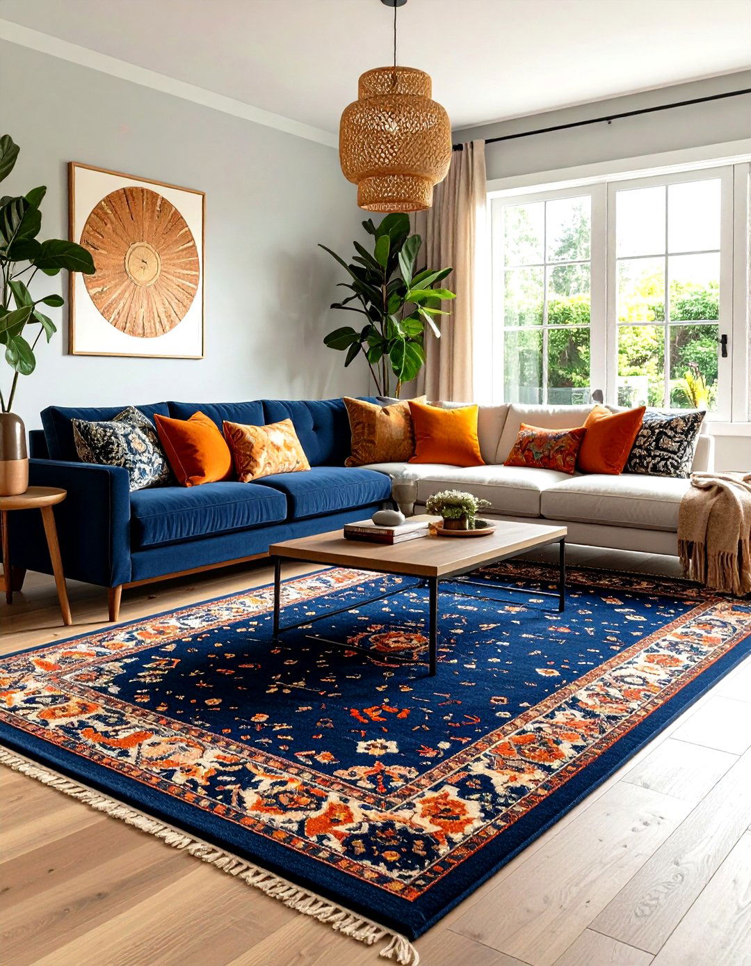
A navy rug flecked with terracotta and cream unifies scattered furniture pieces and instantly marks the “conversation zone. ” Interior pros at Houzz note that a patterned rug is the easiest way to test-drive daring color before committing to paint or upholstery. Pull two hues from the rug for throw pillows so nothing feels random.
11. Use Art as a Color Bridge
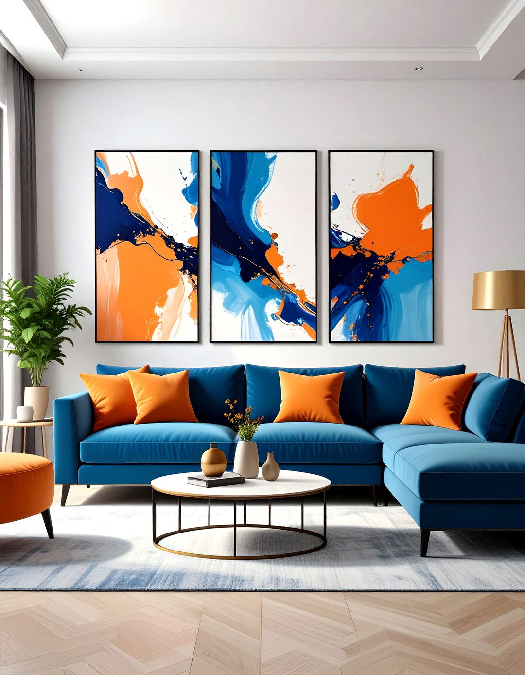
Large-scale abstracts laced with cobalt and apricot connect orange side tables to a blue sectional in one stroke. Elle Decor’s Atlanta art-lover home proves how paintings knit bold furnishings and traditional moldings into a cohesive story. Frame art in slim black so saturated pigments appear modern, not chaotic.
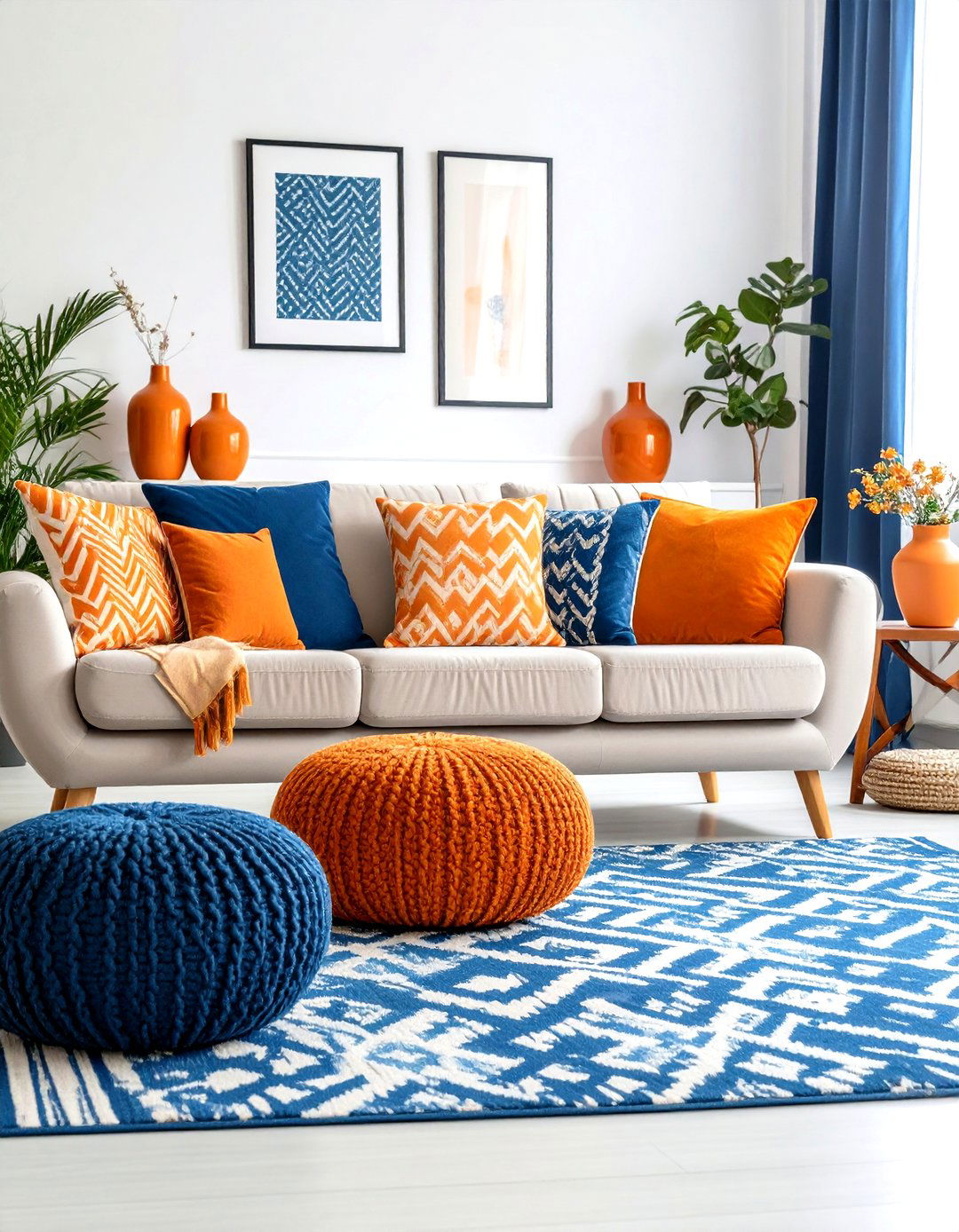
12. Swap Accents Seasonally
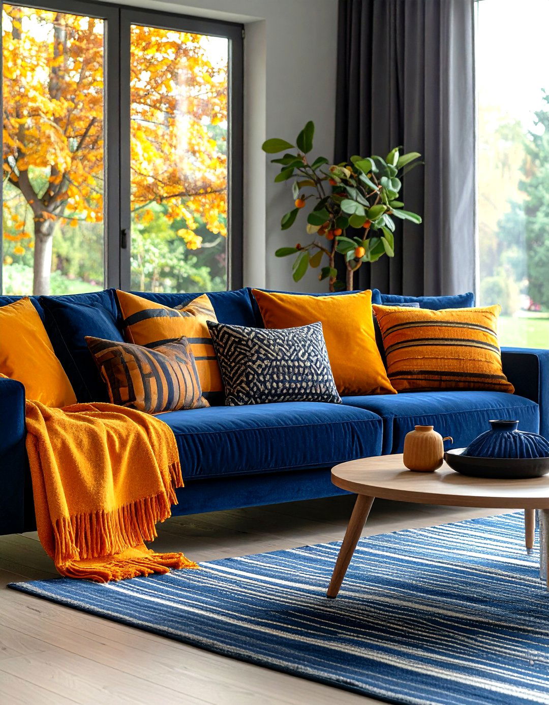
Citrus-striped pillows and cobalt ceramics feel summer-ready; trade them for burnt-orange throws and deep-indigo velvet cushions when temperatures dip. Seasonal swapping leverages color psychology — orange fuels energy during cozy gatherings, while blue keeps winter palettes grounded. Store off-season pieces in vacuum bags to keep the rotation painless.
13. Play With Light and Dark for Depth
A gradient approach — mid-blue walls, navy drapery, pale robin’s-egg accessories — creates atmospheric depth that lets a single blazing orange armchair shine like a sunset. The Spruce highlights tonal layering as a small-space trick to make rooms feel cocoon-like yet spacious.
14. Choose Family-Friendly Performance Fabrics
Look for wipeable leather in saddle-orange and stain-resistant teal crypton for sofas so playful hues endure daily wear. Decorilla designers stress balancing bold with practical, recommending three-color palettes that include at least one forgiving neutral.
15. Expand a Petite Floorplan With Strategic Blues
Designers warn dark navy can visually shrink tight quarters, but pairing it with plenty of light-reflective orange decor and soft white ceilings counters that effect. The Spruce’s paint-size study shows lighter blues on trim and built-ins push walls outward, granting breathing room to small living rooms.
16. Weave in Vintage Touches
Retro ceramic lamp bases glazed in burnt-orange or mid-century teak coffee tables echo the era when this combo first gained popularity. MidCenturyModernGal notes that walnut furniture tempers vivid upholstery and keeps nostalgia chic rather than kitschy.
17. Go Nordic-Minimal With Terracotta and Slate
Scandinavian designers often soften vivid orange to muted terracotta and pick dusty slate blues for a hushed, minimalist living room. Because the palette is lower contrast, texture — think chunky knits and matte pottery — replaces pattern as the interest point, a trend flagged by Emily Henderson’s color-forecast post.
18. Industrial Loft? Add Metal and Ink-Blue Brick
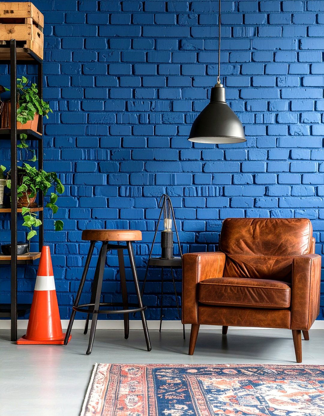
An exposed-brick wall painted charcoal-blue pairs surprisingly well with traffic-cone stools and rust leather, channeling a warehouse vibe. HGTV editors highlight how true orange punctuates cool industrial palettes without competing with steel or concrete.
19. Layer Cozy Textures for Depth
Combine a tufted cobalt velvet ottoman, nubby pumpkin wool throws, and sleek lacquered side tables. Texture keeps the eye exploring so bold hues don’t feel flat. Architectural Digest’s orange-decor roundup underscores tactile variety as key to pulling off saturated palettes.
20. Infuse Global Motifs for Wanderlust
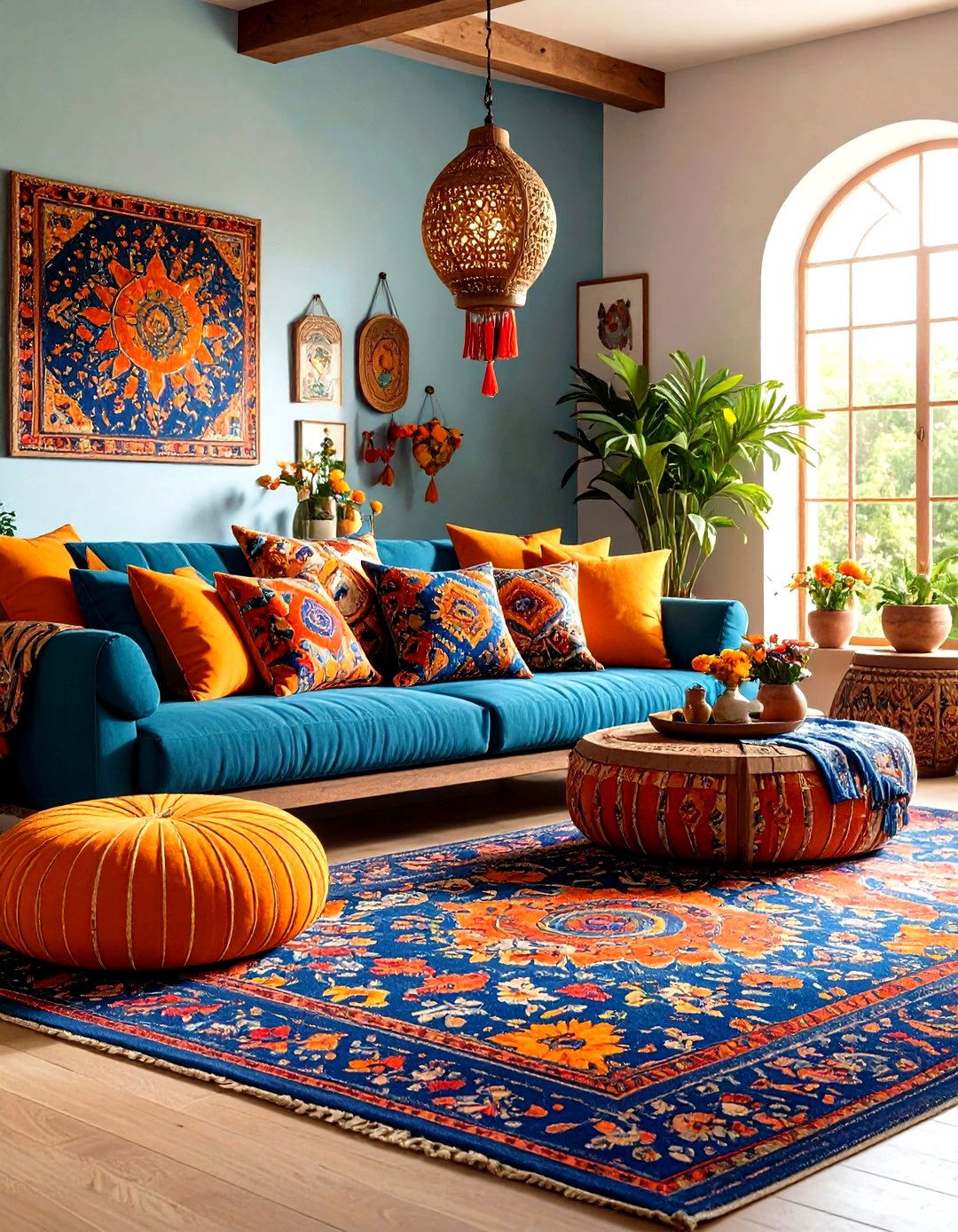
Suzani-style pillows that marry indigo florals with marigold medallions instantly transport your orange and blue living room to Central Asia. The Spruce’s boho guide recommends low-slung seating like poufs for an authentic, lounge-centric arrangement.
21. Upcycle for Sustainable Chic
Refresh a thrifted navy cabinet with matte indigo paint and swap its hardware for brass, then style it with vintage orange glassware. Verywell Mind reminds us orange cues playfulness, so leaning into creative upcycling feels right at home.
22. Sculpt Mood With Layered Lighting
Blue casts can skew cool at night, so swap bulbs in table lamps for warm 2700 K LEDs and use orange-shaded sconces to cast flattering glow. Homes & Gardens notes complementary palettes look best when light temp skews slightly warm. Dimmer switches let you fine-tune vibrancy during movie nights versus parties.
23. Borrow Calm From Nature
Tuck eucalyptus branches into a terra-cotta vase; the muted sage adds a third, grounding hue that designers say bridges hot-cold contrasts. Better Homes & Gardens shows deep teal, warm wood, and orange working together to echo forest, earth, and sunset.
24. Think About Furry Friends
Choose low-pile navy rugs that camouflage pet fur and washable mandarin slipcovers. Decorilla recommends limiting your palette to three dominant tones so replacement covers stay easy to source. A rust pet bed can even double as an accent piece.
25. Refresh on a Shoestring With Accessories
Not ready for paint? Start with a cobalt throw, pumpkin ceramic lamp, and two patterned pillows — often available for under $100 total. HGTV’s “colors that go with orange” gallery shows how even kids’ rooms harness this inexpensive pairing for big impact. Rotate pieces seasonally to keep the look feeling novel.
Conclusion:
From color-wheel science to coastal calm, the orange and blue living room proves endlessly adaptable. Orange’s sociable warmth enlivens gatherings, while blue’s composure keeps things grounded, letting you dial the mood from playful to polished with nothing more than proportion and texture tweaks. Use these 25 ideas as building blocks, experiment fearlessly, and you’ll craft a space that feels as dynamic and balanced as the colors themselves.
Related posts:
Leave a Reply