Choosing a nursery color today isn’t just about looks — it's about creating an atmosphere that settles babies, supports tired parents, and flexes as children grow. Paint-company forecasts for 2025 lean toward grounded earth tones, misty blues, and sophisticated pastels. Child-development research also confirms that muted, nature-inspired hues help calm the nervous system and encourage better sleep. The 25 ideas below pair those findings with practical decorator tips so you can paint once and enjoy the room for years.
1. Sage Green Serenity Nursery Color
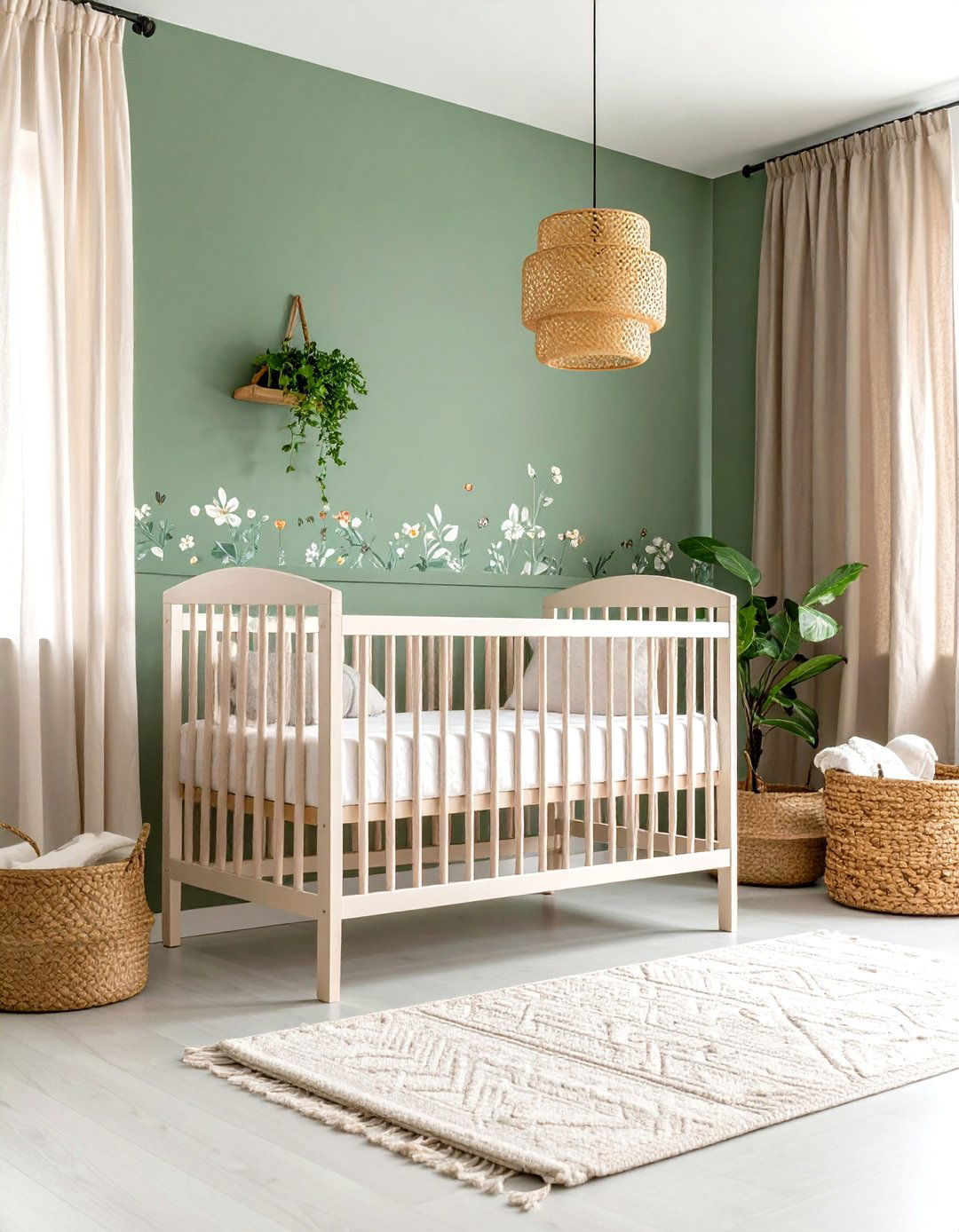
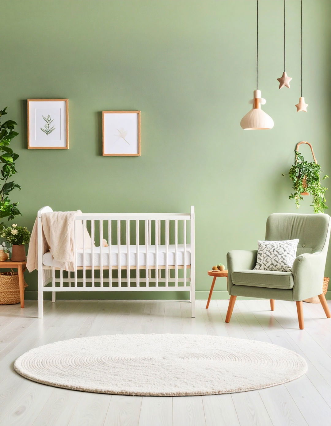
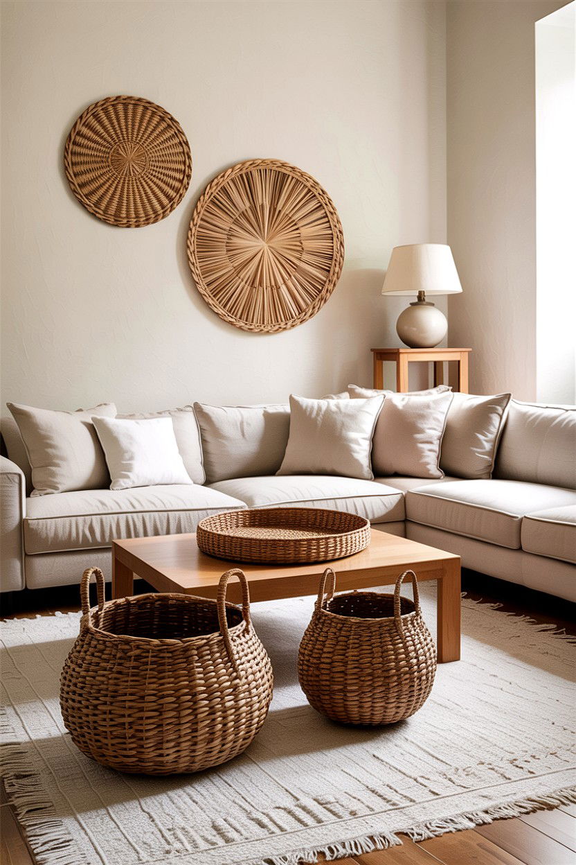
A soft sage green nursery color wraps the room in the tranquil feeling of a forest walk. Designers highlight sage for its ability to mute stimulation while staying fresh in daylight. Pair it with linen curtains, rattan baskets, and an oak crib to echo the outdoor connection that trend forecasters say parents crave in 2025. If you want subtle contrast, paint the closet doors two shades deeper or add a botanical wallpaper strip behind the cot — instant depth without visual overload.
2. Dusty Rose Blush Nursery Color
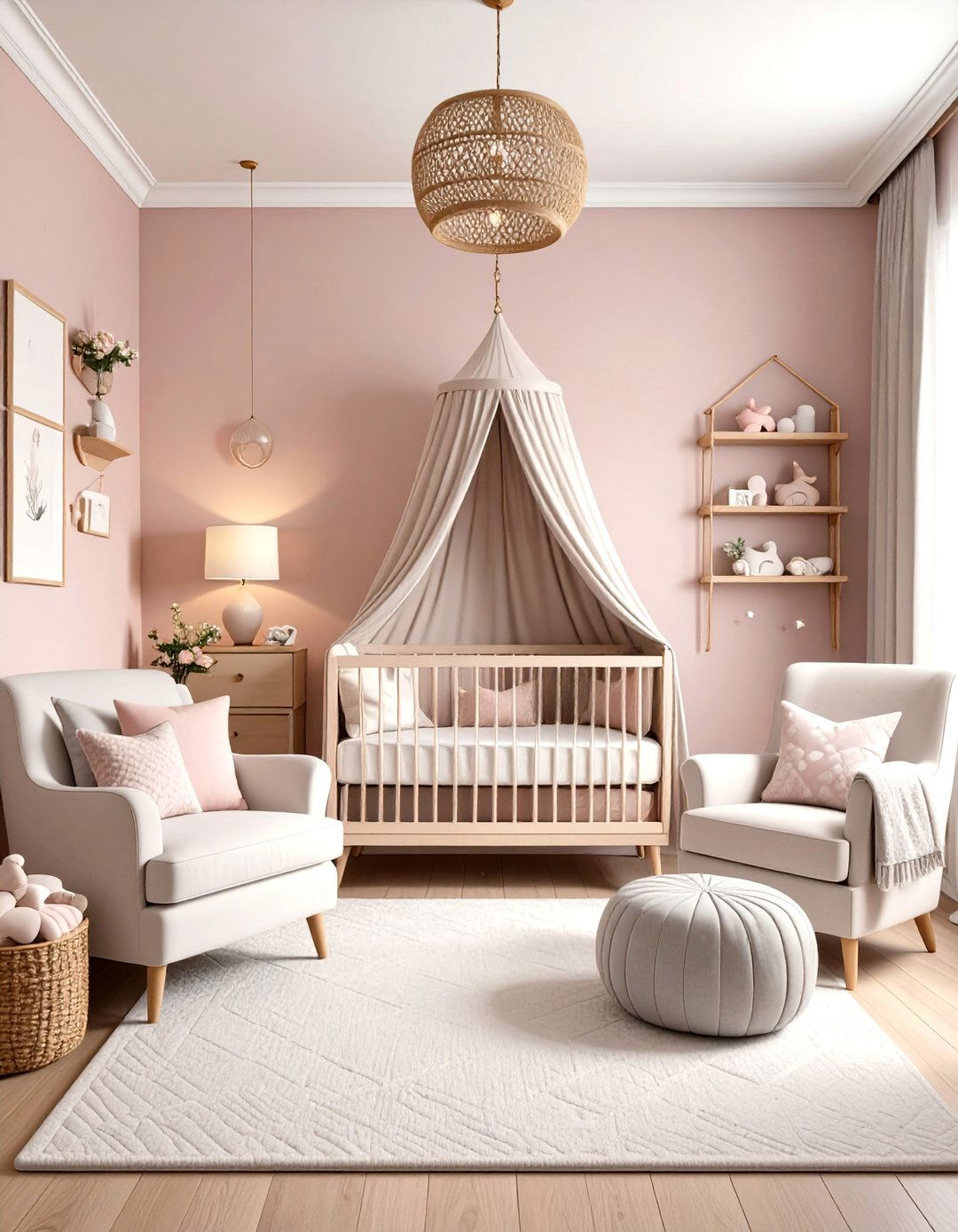
Unlike bubble-gum pinks, dusty rose nods to tradition while feeling sophisticated enough to grow with your child. Its gray undertone reads warm at night and airy by day, providing a flattering backdrop for wood or white furniture. Layer quilted muslin sheets, boucle cushions, and cane shelves to keep the tone balanced. The timeless calm of dusty rose has already displaced “millennial pink” on many 2025 mood boards.
3. Classic Navy & White Nursery Color
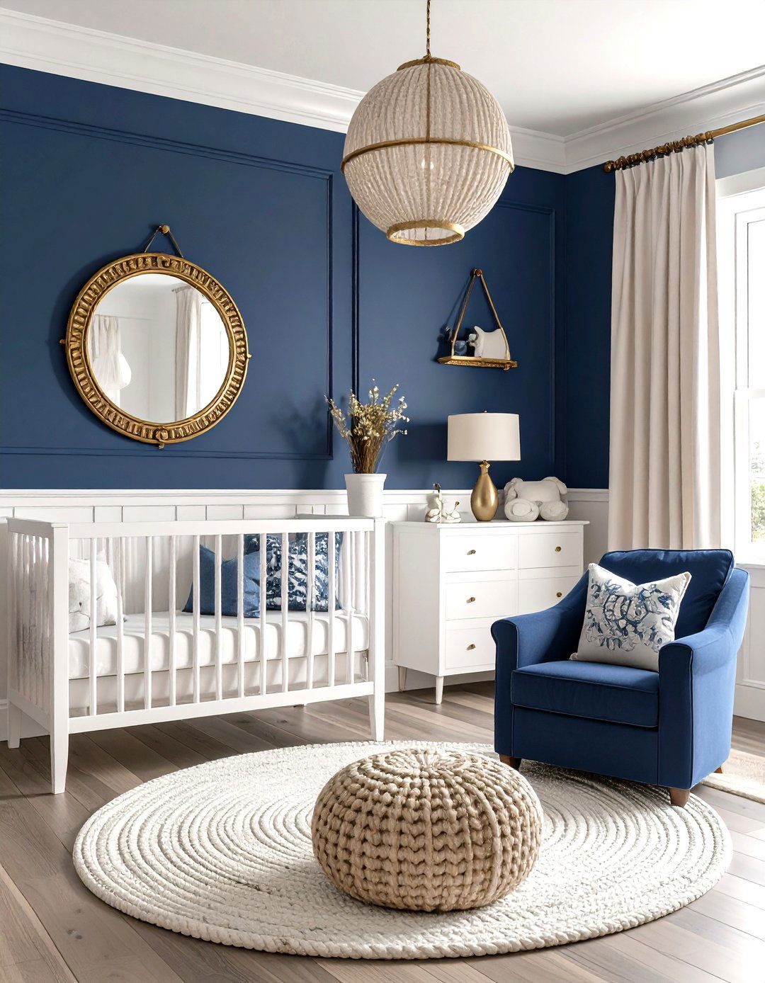
A crisp navy-and-white scheme remains a perennial favorite because high contrast stimulates infant vision yet feels orderly for adults. Use white on three walls and coat the fourth in deep nautical navy — Benjamin Moore recommends keeping accent walls a few shades darker for balance. Designers also include navy in 2025 marine-inspired palettes for its timelessness. Add a brass porthole mirror or rope-knit pouf for subtle nautical texture without locking you into a baby-only theme.
4. Warm Terracotta Hug Nursery Color
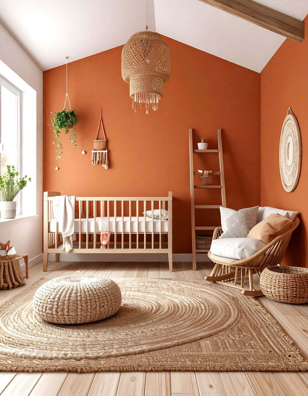
Terracotta is trending as parents seek hues that feel like a warm embrace but still photograph beautifully. Keep the pigment matte so evening lamps don’t create glare, then balance the warmth with creamy ceilings and a jute rug. Terracotta hides scuffs — practical for toddler years — and later morphs effortlessly into a desert-modern kids’ room.
5. Mustard & Gray Cheerful Nursery Color
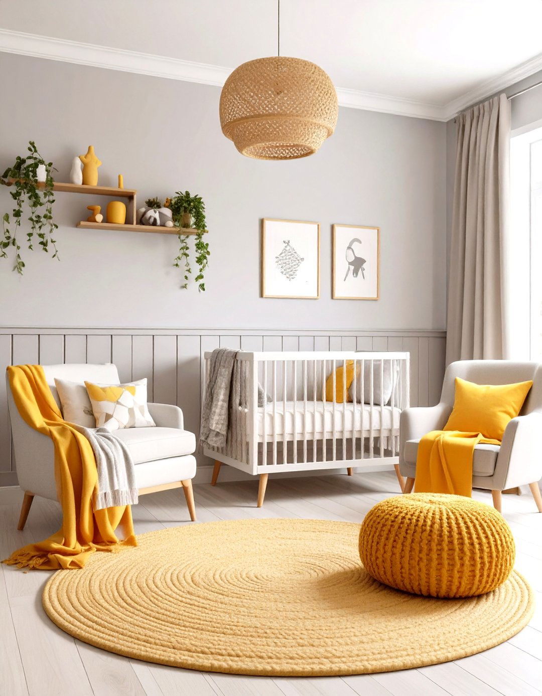
Cheerful mustard teamed with soft gray offers a gender-neutral palette that’s sunny yet sophisticated. Dulux’s warm “True Joy” yellow is set to appear more in 2025 interiors. Paint a half-height mustard wainscot with light-gray upper walls to deliver visual interest at baby’s eye level while preventing overstimulation. Charcoal-and-white geometrics and deeper ochre throws keep the look flexible.
6. Lavender Mist Calm Nursery Color
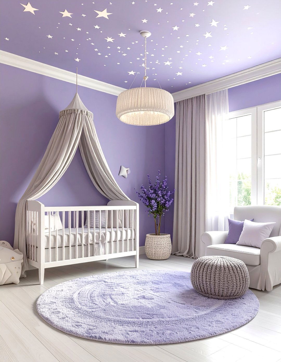
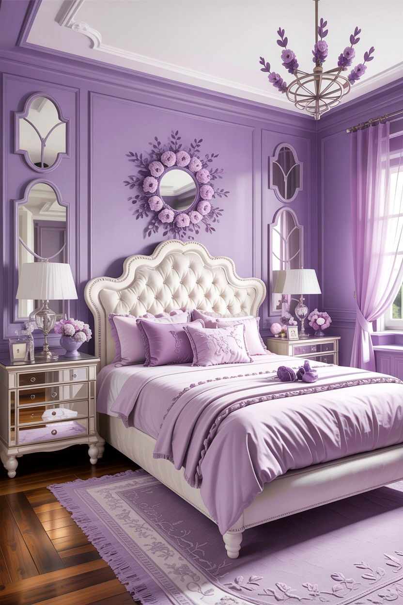
Lavender blends the calm of blue with the nurturing undertones of pink, earning a spot among The Spruce’s top soothing colors. Designers call it a warm alternative to dusty blue that pairs elegantly with mushroom neutrals. Stencil tiny pearl stars on the ceiling for a subtle, sleep-friendly accent.
7. Sky Blue & Cloud White Nursery Color
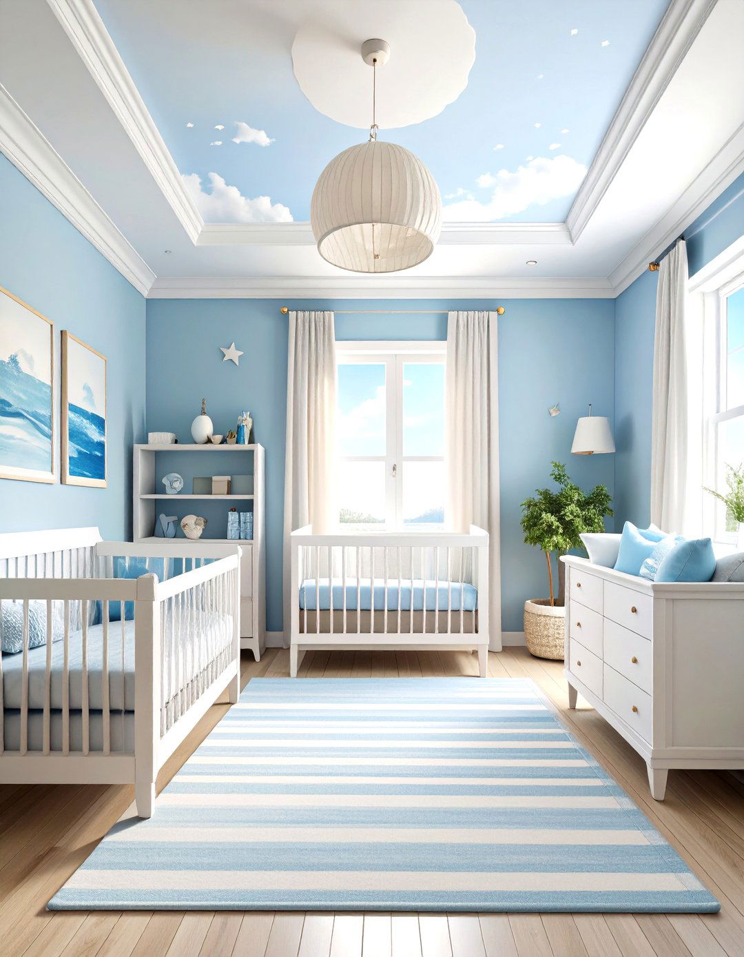
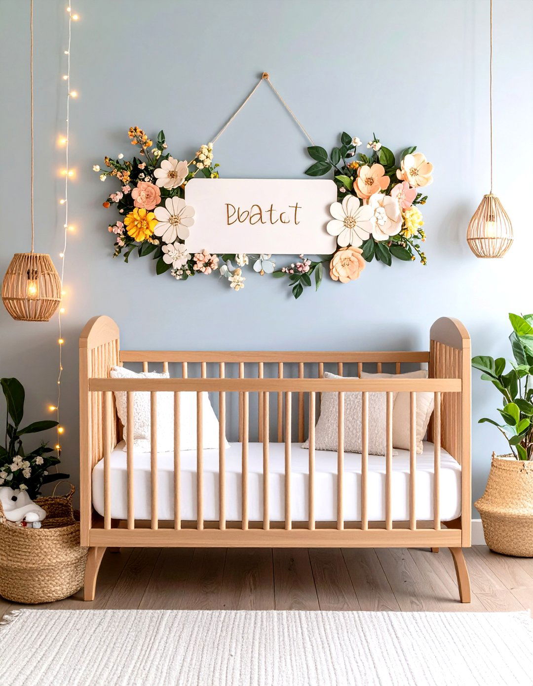
Soft coastal blues rank high on 2025 lists for grounding rooms regardless of gender. Muted blue walls can reduce heart rate and anxiety, supporting longer naps. Combine matte sky-blue walls with a cloud-white ceiling, striped crib sheets, and watercolor ocean prints for a horizon effect that transitions easily into toddler décor.
8. Earthy Taupe Cocoon Nursery Color
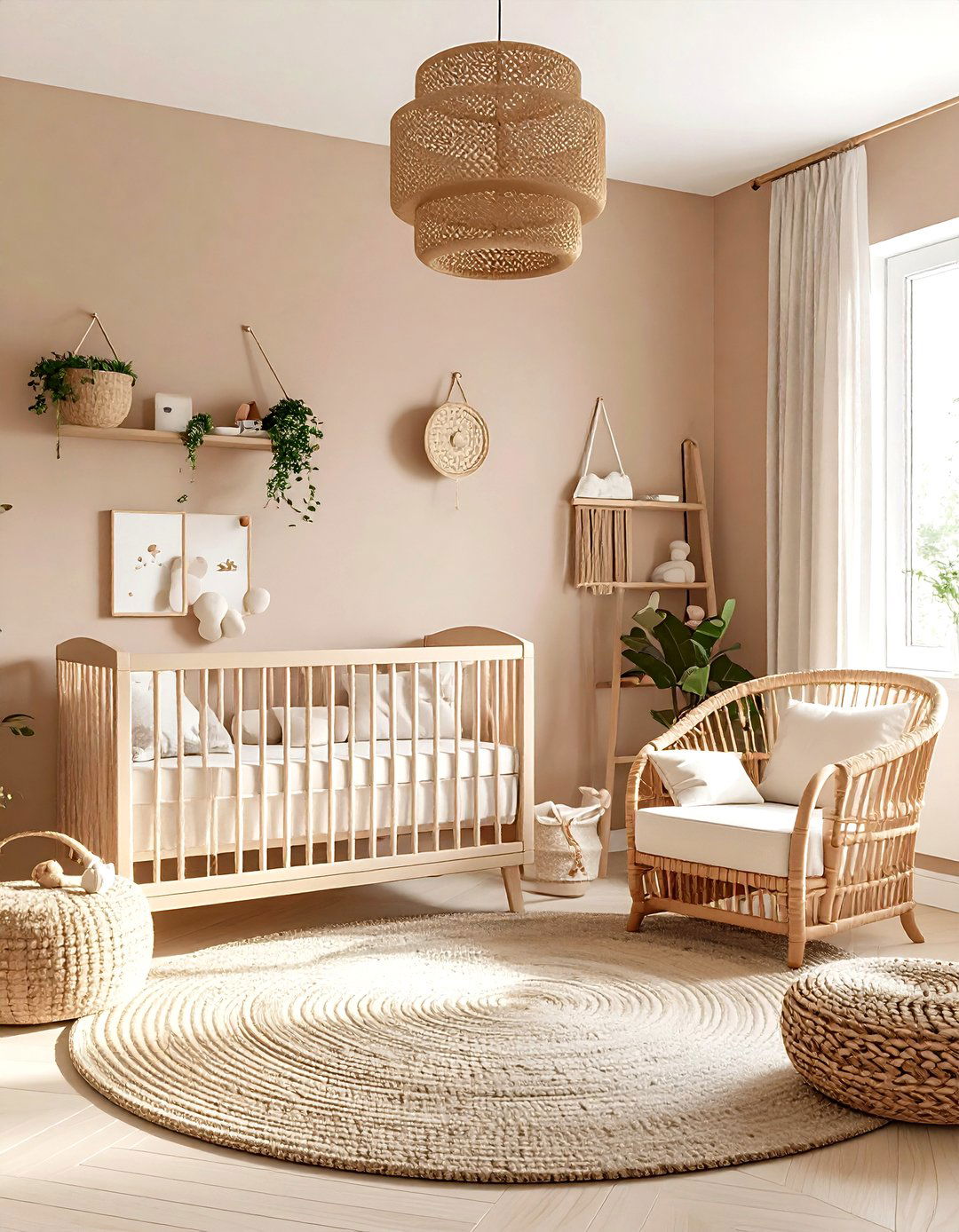
Earthy taupe — the “new gray” — adds warmth without overwhelming small rooms. The Baby Cot Shop lists taupe among its earthy tones for 2025, praising its harmony with rattan, oak, and linen. A flat finish enhances the cocoon effect; chunky knits and a terracotta lamp add tactile interest.
9. Monochrome Black & White Nursery Color
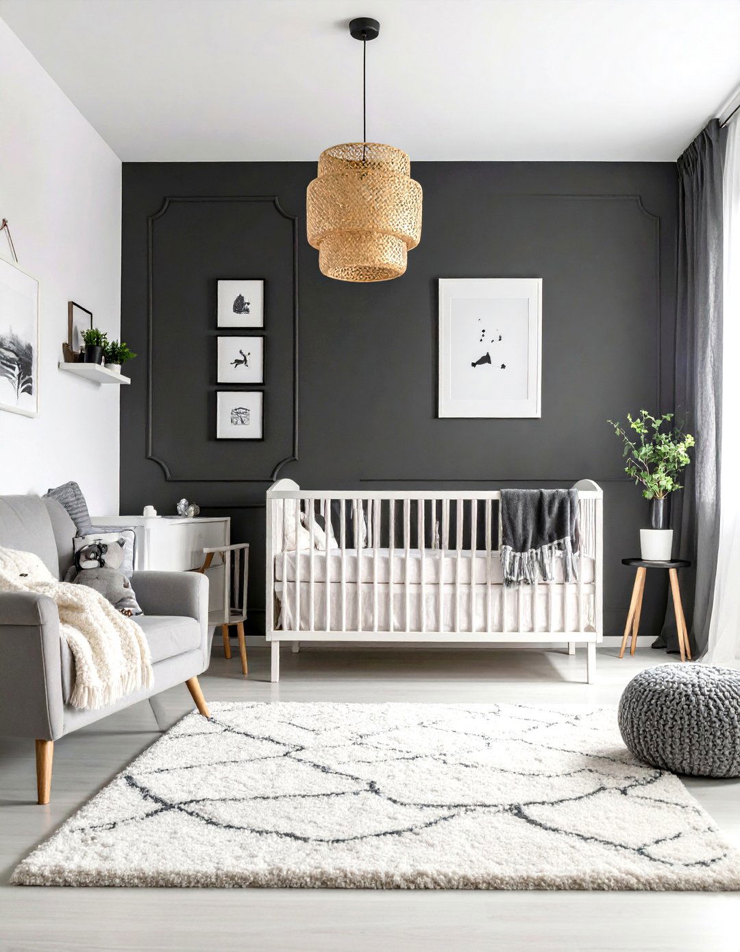
High-contrast patterns aid newborn eyesight, but too much black can overstimulate. Keep black to about one-third of visible surfaces and use decals or a half-painted crib instead of full walls. Warm the scheme with a wool rug or blonde-wood frames to avoid a clinical vibe.
10. Sunny Butter Yellow Nursery Color
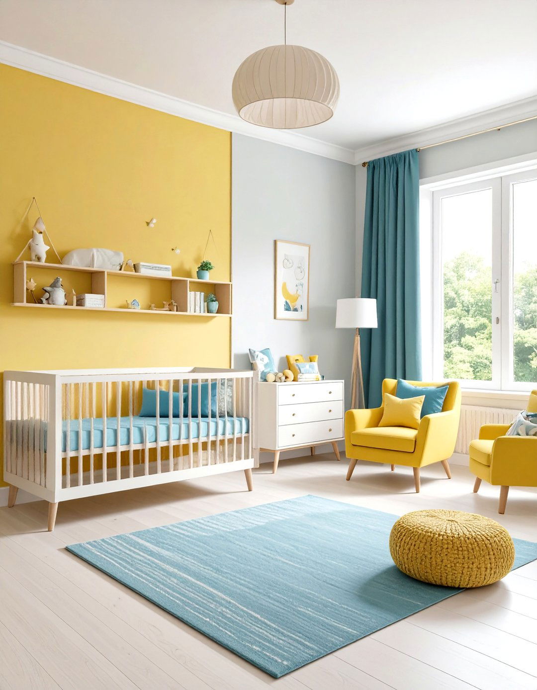
Gentle butter yellow delivers happy energy without bright-lemon overstimulation. The Spruce lists dandelion-inspired yellows as uplifting yet calming, especially with white trim and light wood. Limit yellow to the upper wall, paint the lower section greige, and balance with sage or sky-blue textiles.
11. Mint & Coral Splash Nursery Color
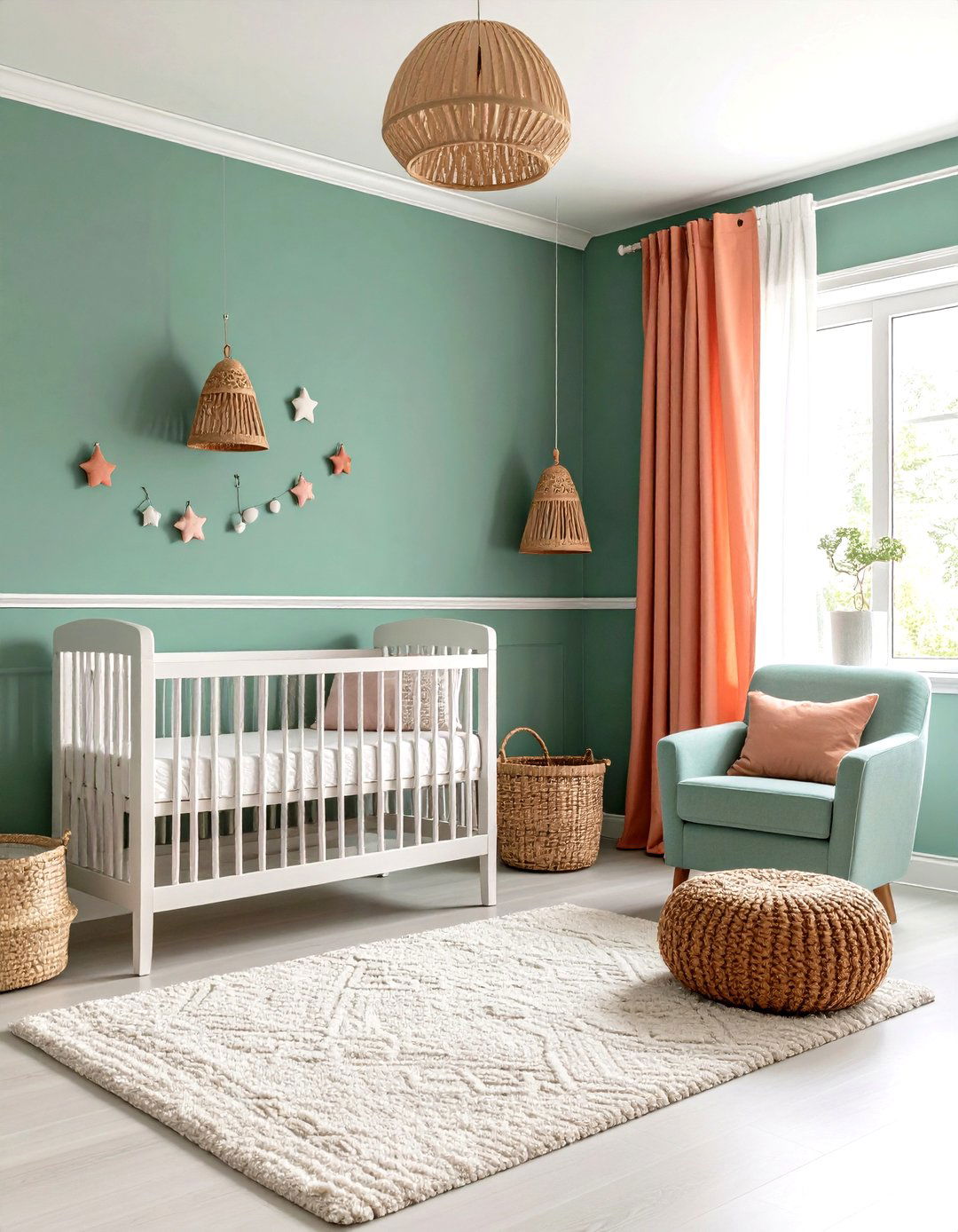
Mint plus coral mirrors Better Homes & Gardens’ accent-wall advice: pale base, vibrant pop. Benjamin Moore notes pale greens invite tranquility, keeping the scheme peaceful despite the playful coral wall. Ground the look with white trim and natural-fiber baskets.
12. Peachy Dream Nursery Color
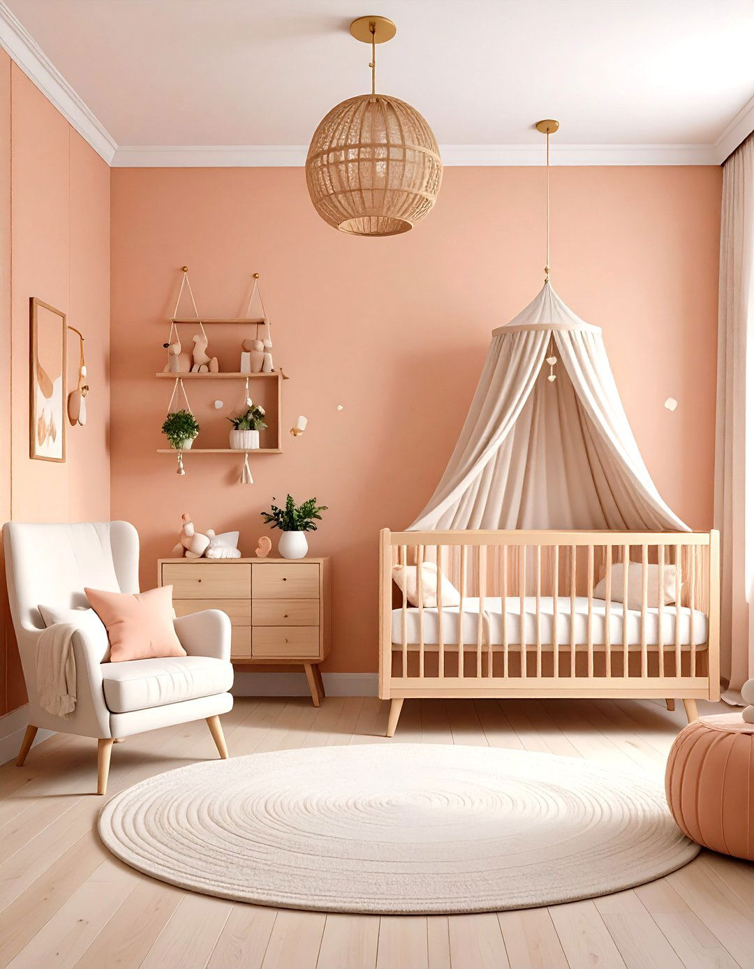
Pastel peach provides sunrise warmth without intensity and keeps cortisol levels steady. Board-and-batten half walls, brass sconces, and natural-wood mobiles maintain its gentle glow and pair effortlessly with mint, navy, or terracotta later.
13. Aqua Adventure Nursery Color
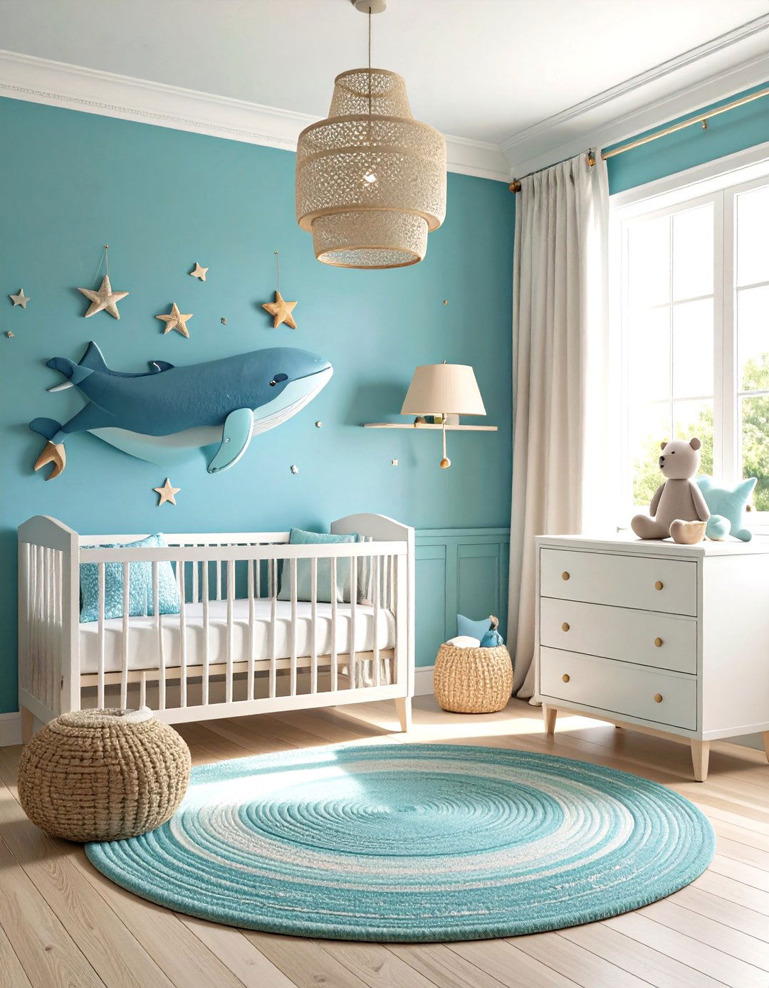
Aqua merges blue calm with green freshness, echoing Sherwin-Williams’ Wellspring palette of mystical hues. Lower-wall aqua panels with whisper-white tops visually lift ceilings; whale art and tan bins keep it playful yet grounded.
14. Mauve & Mushroom Nursery Color
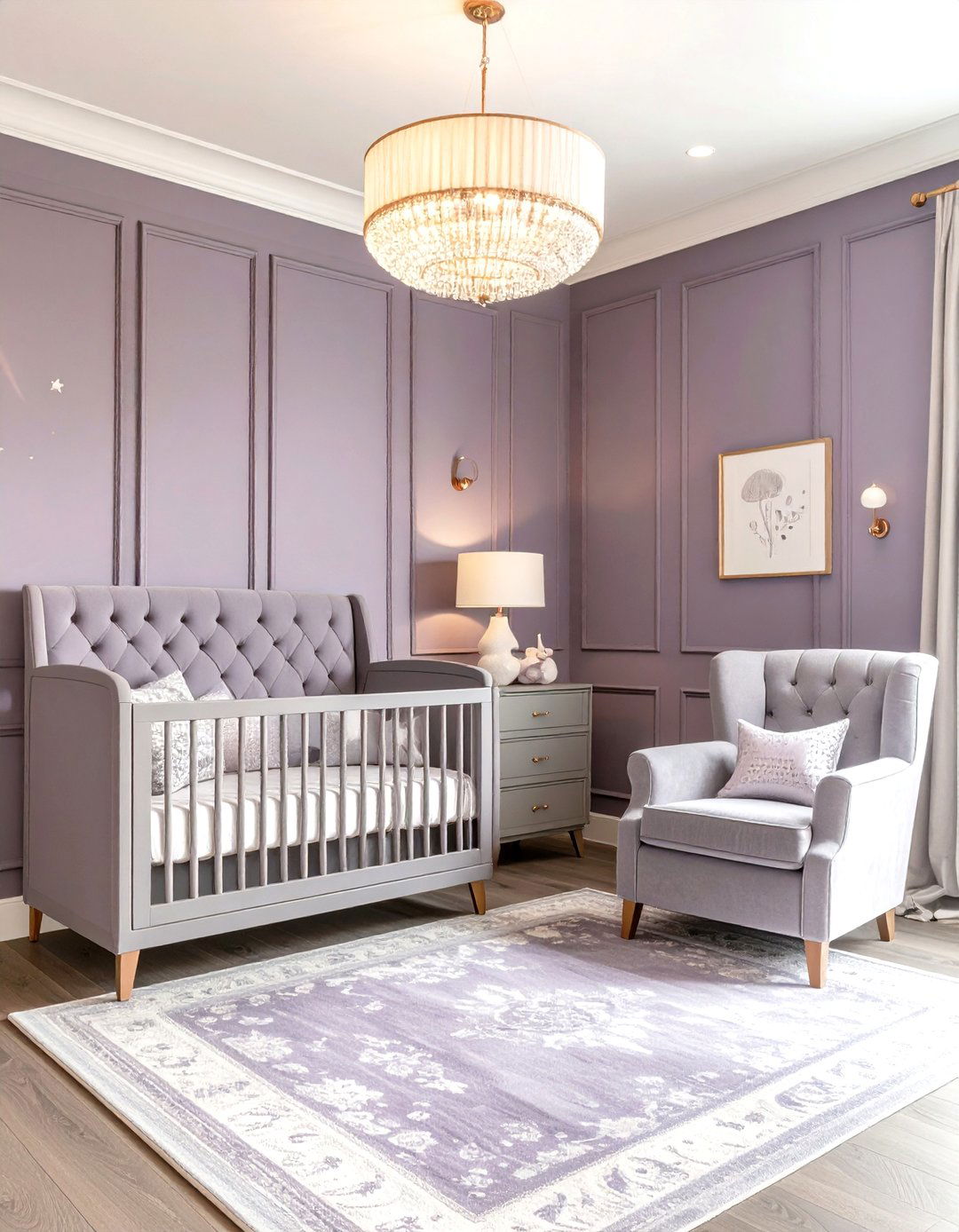
Architectural Digest cites dark mauve as a sophisticated twist on pink, while forecasts hail mushroom gray as the new neutral. Mushroom board-and-batten framing mauve panels adds depth; rose-gold hardware elevates the luxe yet calming palette.
15. Cool Charcoal Accent Nursery Color
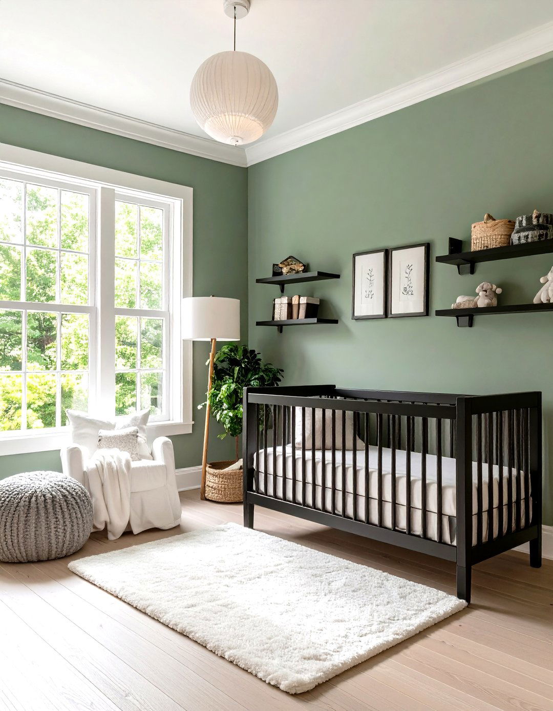
Sherwin-Williams’ Paradox palette pairs pastels with grounding darks, making charcoal a strategic accent. Outline window trim or shelves in charcoal satin against light sage walls; plush white textiles and warm lighting soften the definition for parents.
16. Woodland Greens & Browns Nursery Color
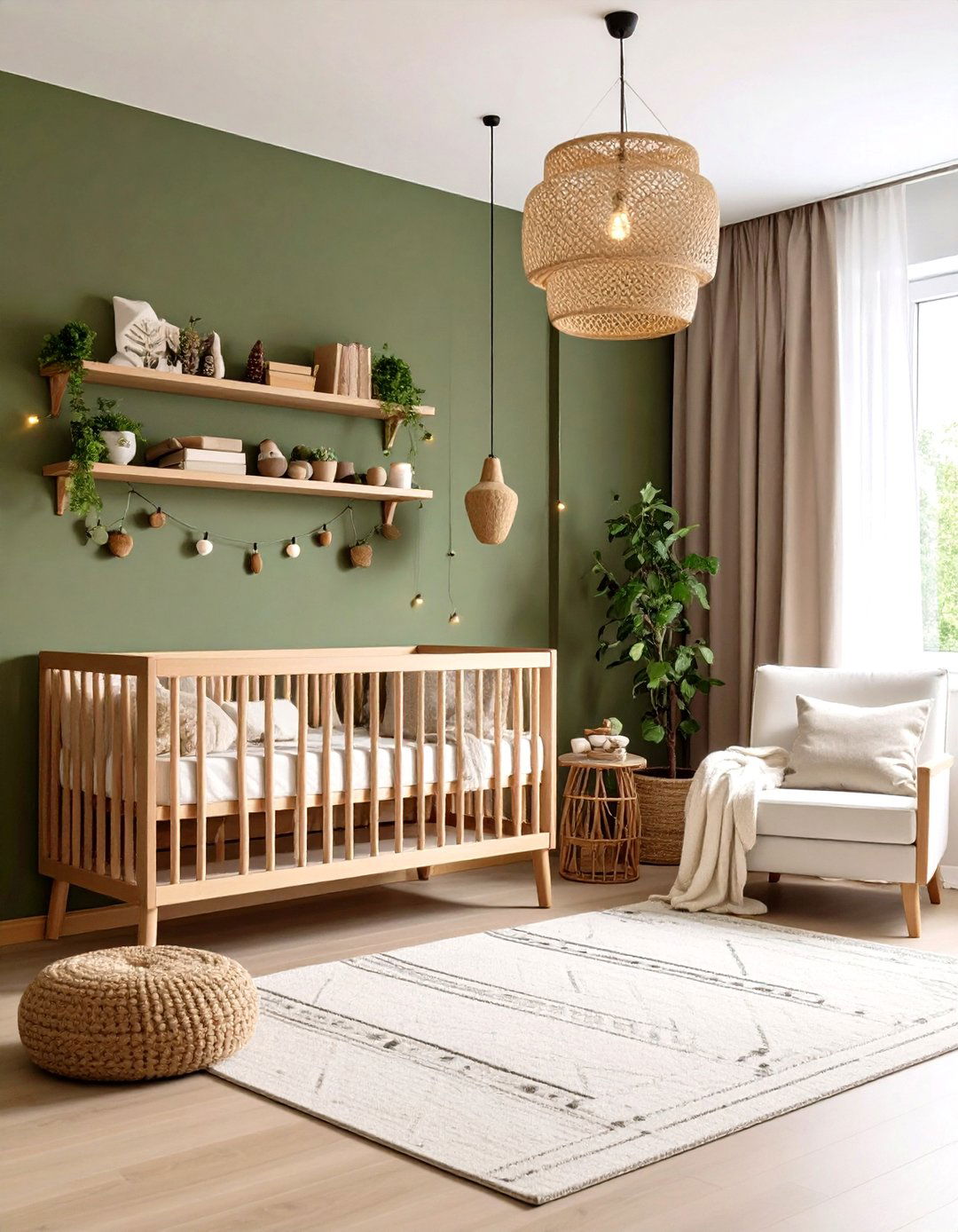
Southern Living calls mid-greens “timeless neutrals, ” and Baby Cot Shop highlights olive paired with terracotta for outdoor calm. Olive walls, walnut shelves, and acorn knobs create a canopy effect complemented by birch-branch fairy lights.
17. Coral Reef Pop Nursery Color
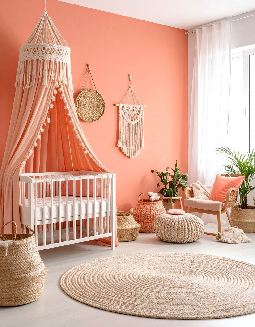
Better Homes & Gardens recommends coral “Setting Plaster” for a flattering accent wall. Off-white adjoining walls and grosgrain coral drapery trim complete the look; rope baskets ground the energizing red-orange tones.
18. Pastel Rainbow Whimsy Nursery Color
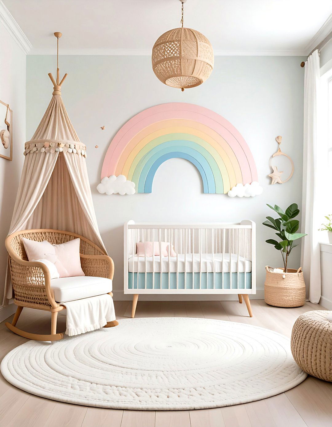
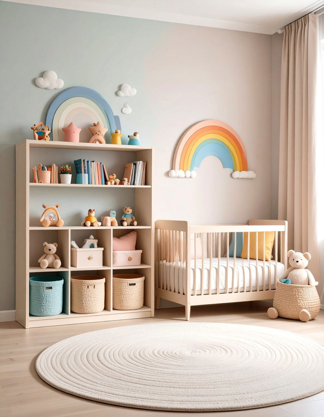
Color psychologists warn that saturated rainbows can overstimulate, so keep arcs chalky and subdued. A scalloped pastel rainbow on one wall, white surroundings, and linen-wicker textures deliver playful serenity.
19. Scandinavian Neutral Nursery Color
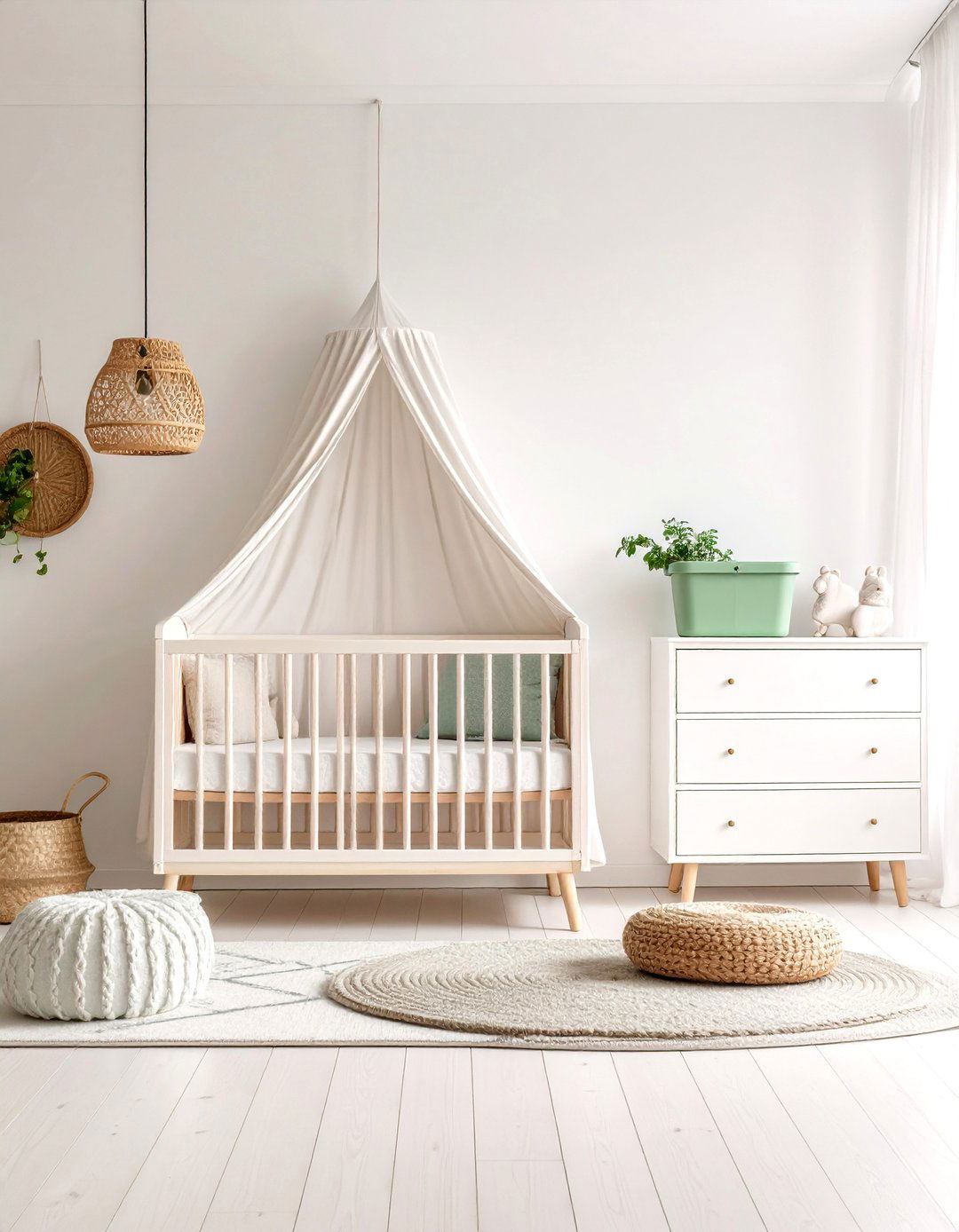
Baby Cot Shop previews warm taupe and mushroom grays as airy bases, while Sherwin-Williams’ Chrysalis palette champions powdery neutrals plus celadon accents. Off-white walls, blonde-birch furniture, and a single sage bin keep the minimalist vibe bright and adaptable.
20. Slate Blue & Copper Nursery Color
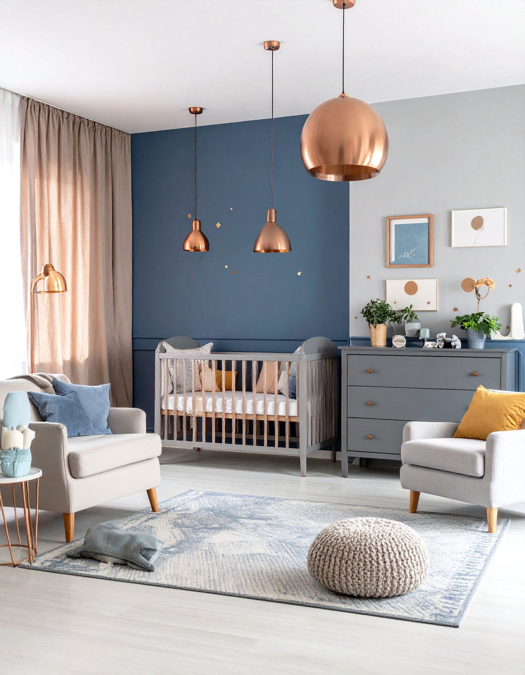
Sherwin-Williams’ Wellspring notes mineral blues trending in nurseries. One slate wall, pale-linen surrounds, and hammered-copper hardware add warmth. Healthline confirms blue’s calming effect on the brain. Swap copper for matte black later and the palette stays teen-ready.
21. Blush & Gold Luxe Nursery Color
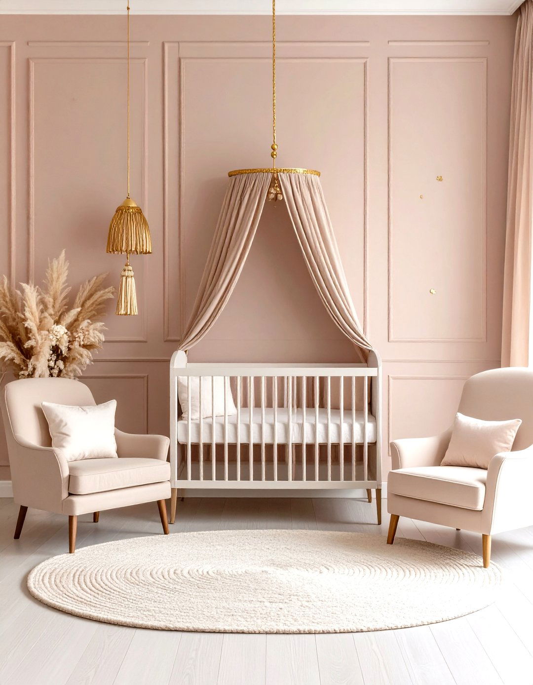
Blush plus brushed gold offers a grown-up take on feminine décor. Ultra-light blush walls (LRV ≈ 70) keep daylight airy; matte-gold knobs, a gilded mirror, and metallic tassels provide sparkle. The scheme photographs beautifully for milestone pictures.
22. Olive & Cream Nature Nursery Color
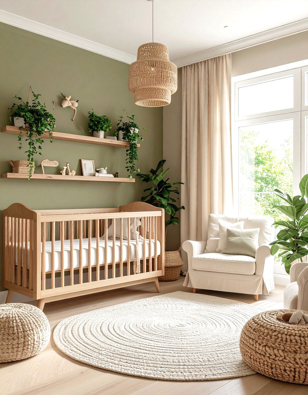
Southern Living highlights Clary Sage as a timeless mid-green, and Baby Cot Shop teams olive with warm creams. Lower-wall olive with cream above maximizes light; a slim oak rail doubles later as art ledge.
23. Teal & Terracotta Bold Nursery Color
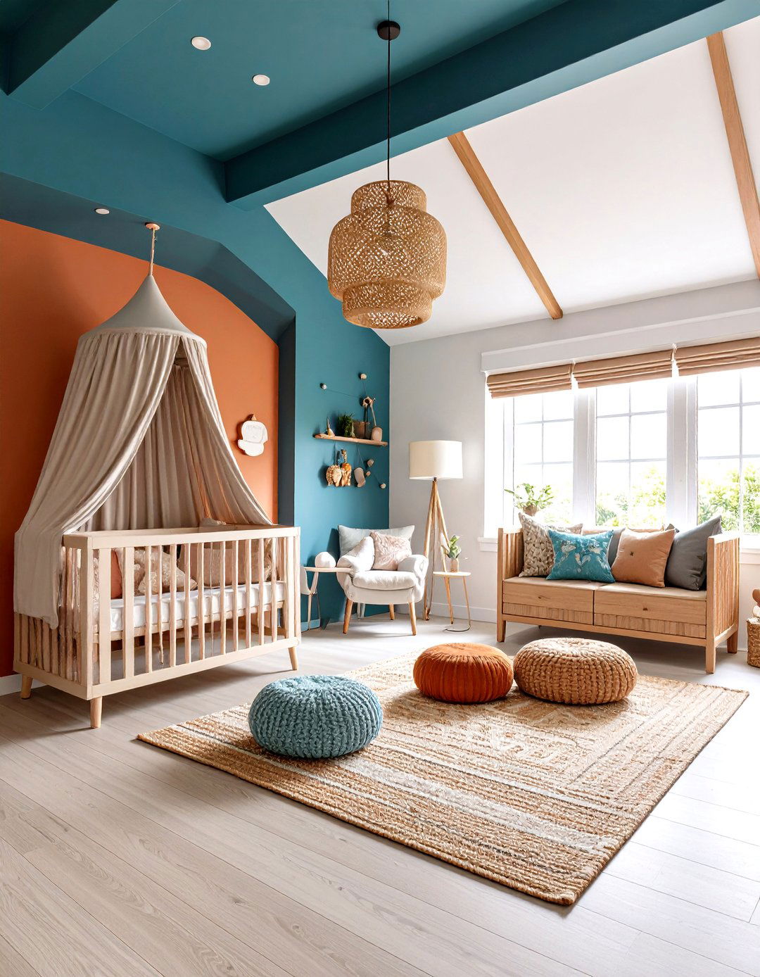
Deep teal — an underrated designer favorite — adds depth, especially when balanced with terracotta, a 2025 earthy staple. Teal ceilings pique infant curiosity; pale terracotta walls ground the palette while light-oak furniture keeps it airy.
24. Citrus Sorbet Energy Nursery Color
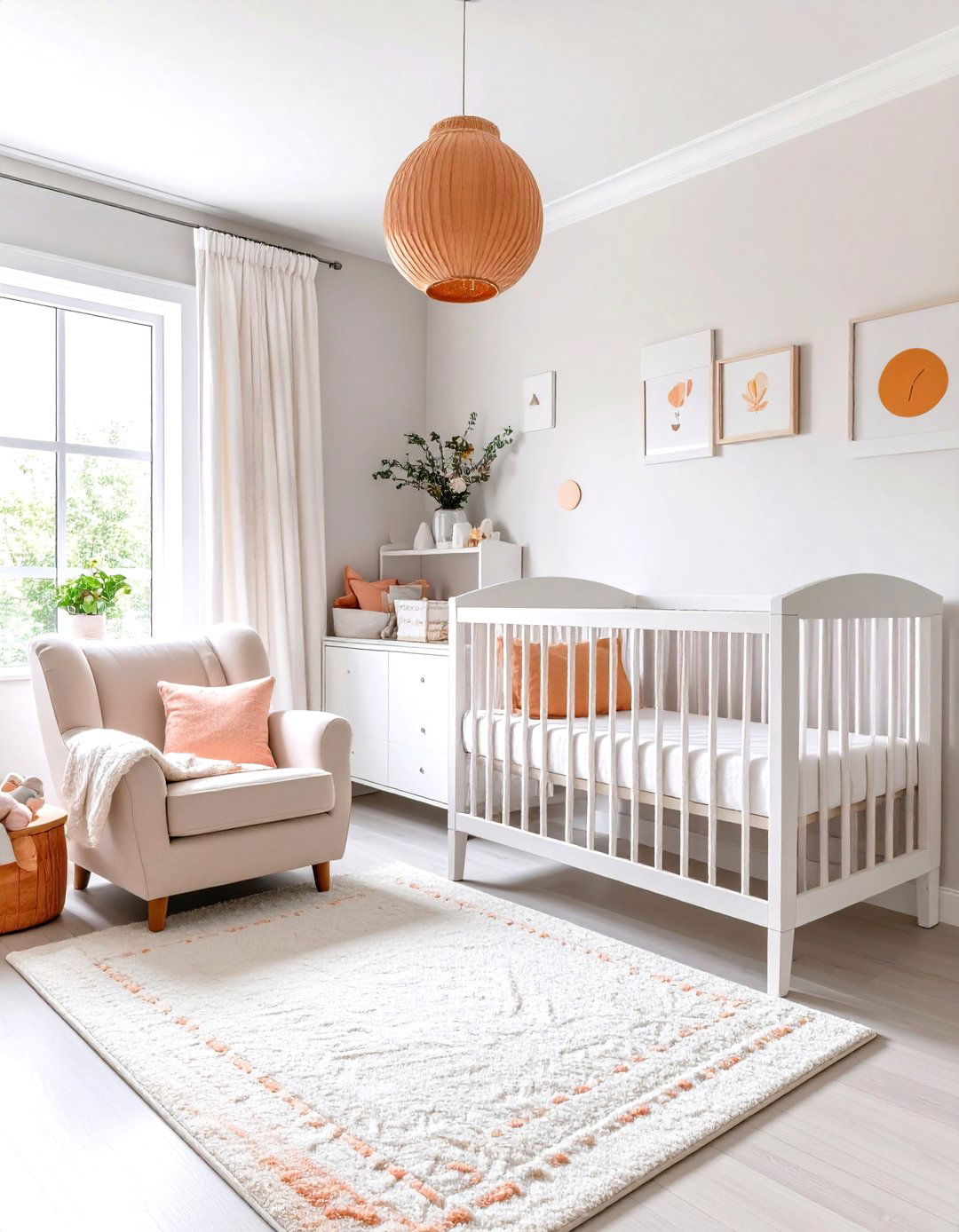
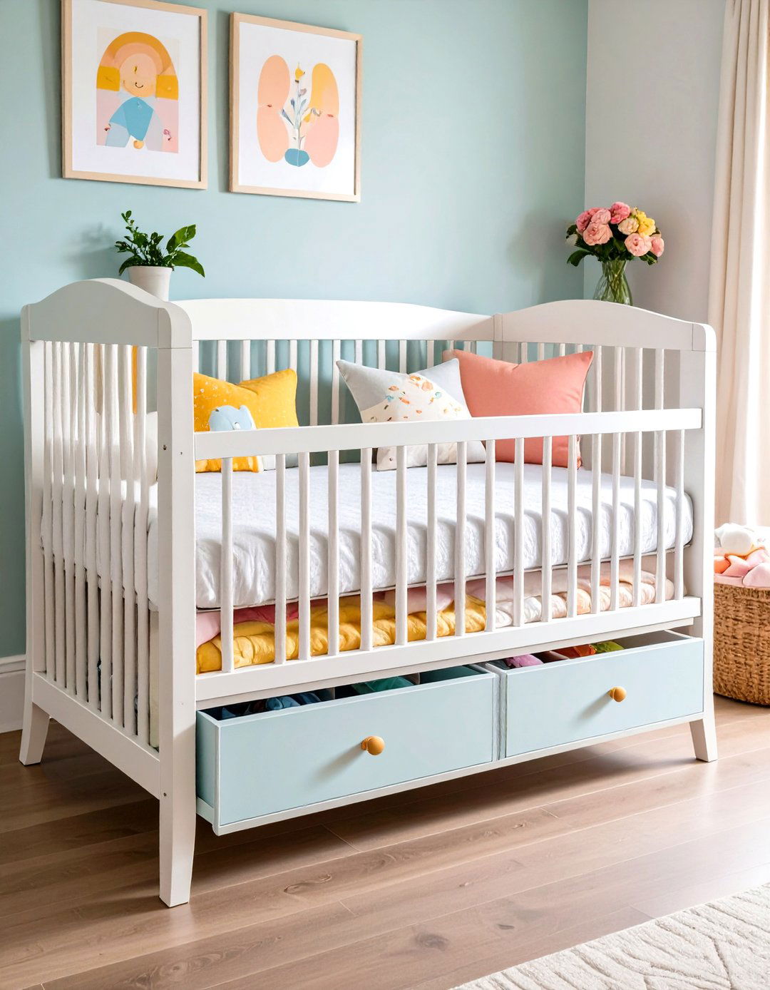
Sherwin-Williams’ Paradox capsule champions muted versions of bright hues, perfect for citrus sorbet layers of grapefruit, apricot, and lime. Lime color-blocks, apricot drawers, and grapefruit cushions energize mornings, yet white surrounds prevent overload — even small rooms feel bigger as light bounces off these tones.
25. Lilac & Mint Twilight Nursery Color
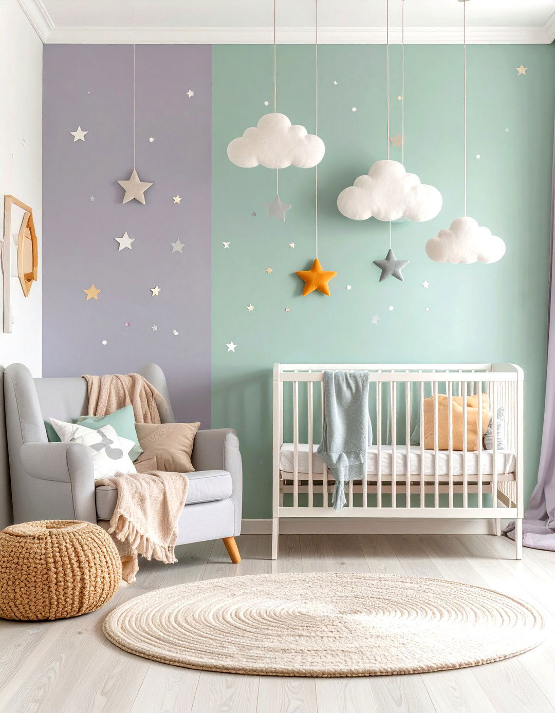
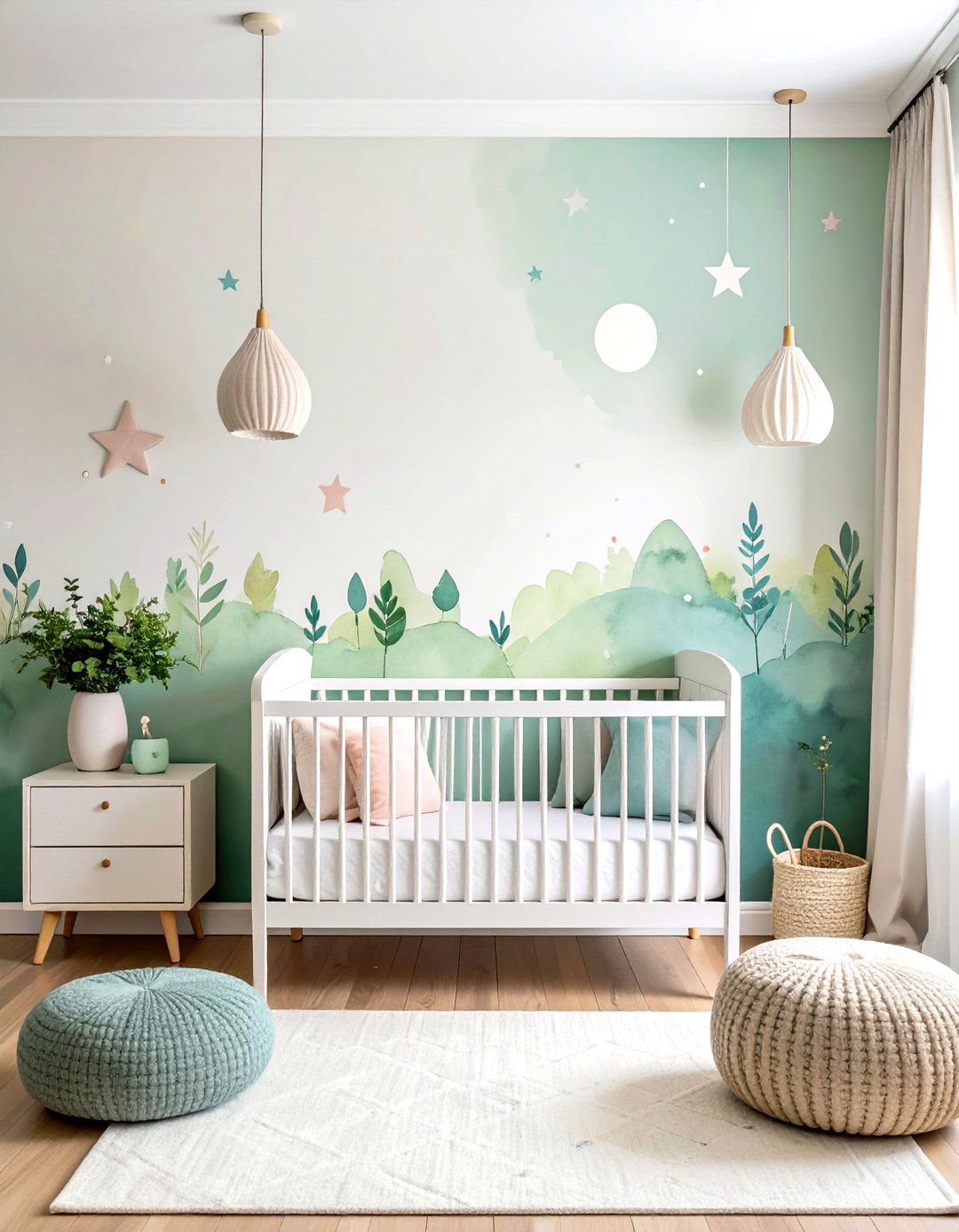
The Spruce praises lavender-lilac for stability and warmth, while Benjamin Moore lists pale greens as nurturing. Upper-wall lilac, lower-third mint, and a slim white chair rail evoke a twilight horizon. Star decals and wool-cloud mobiles finish the sleepy storybook scene.
Conclusion:
From sage serenity to citrus sorbet zest, these nursery color ideas blend research-backed calm with 2025’s bold, earthy, and pastel trends. Soft greens, taupes, and blues reassure tiny nervous systems, while curated pops of coral, mustard, or copper let parents express personal style. Each palette is built to age gracefully — swap accessories, not wall paint — so your child’s room can evolve from newborn haven to creative play space with minimal effort. Let these hues guide you toward a nursery that soothes, inspires, and grows alongside your little one.



Leave a Reply